PURSUIT | DELOITTE
The Color of Change
When two companies become one, the new thing has to look inevitable rather than assembled. The answer was not to describe a merger. It was to photograph one happening.
ROLE
Creative direction, art direction, photography, image compositing, print production
DELIVERED
A pursuit at this level ran six months to a year and produced a system, not a document. Websites, printed books, digital delivery, presentations, a constant stream of meeting materials, and pieces that had no precedent.
The Work
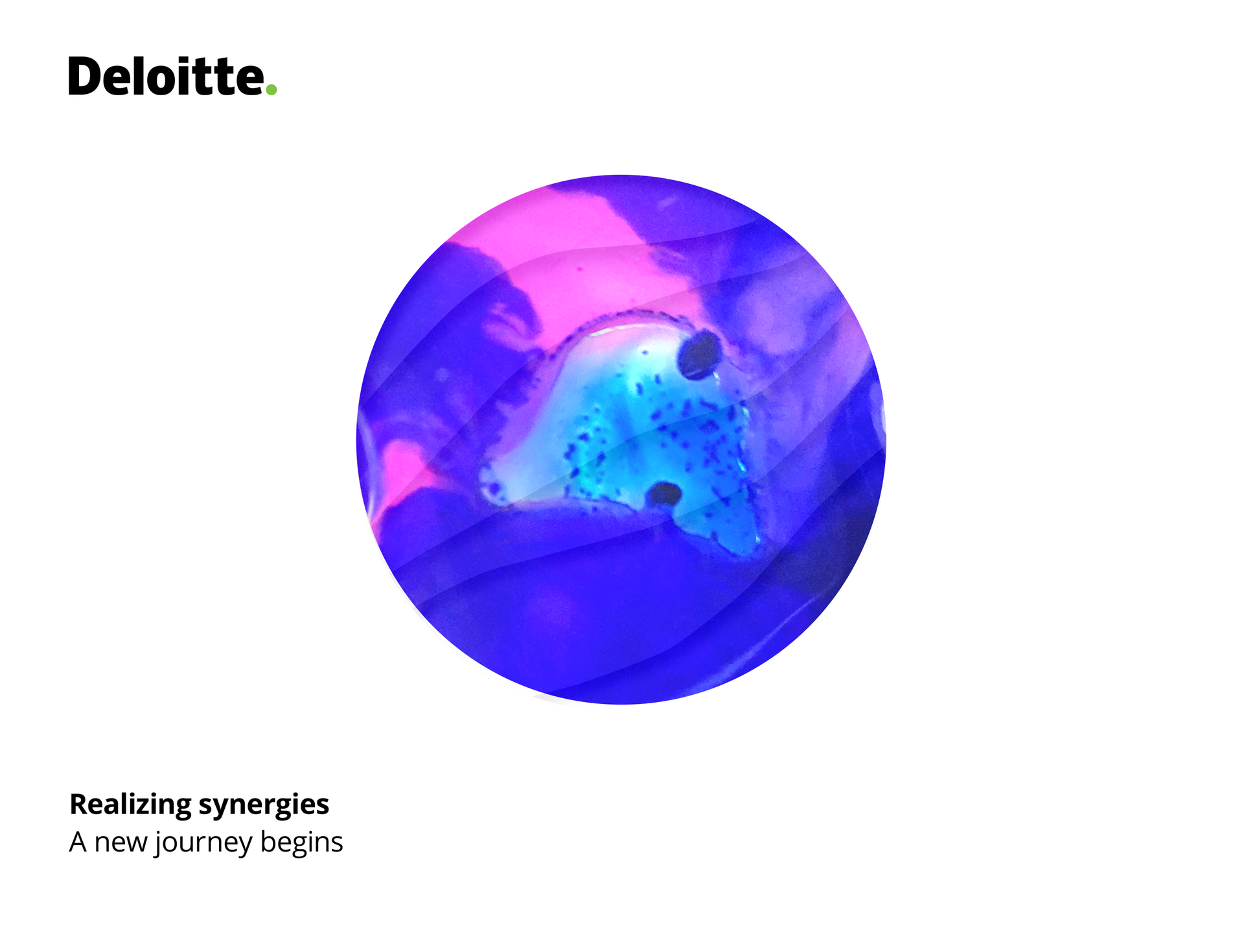
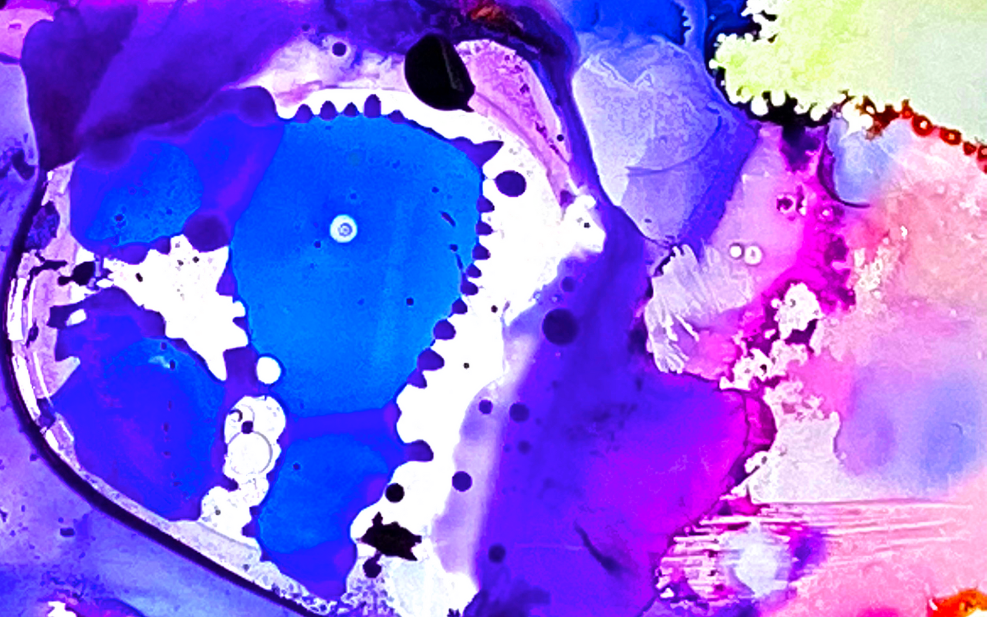
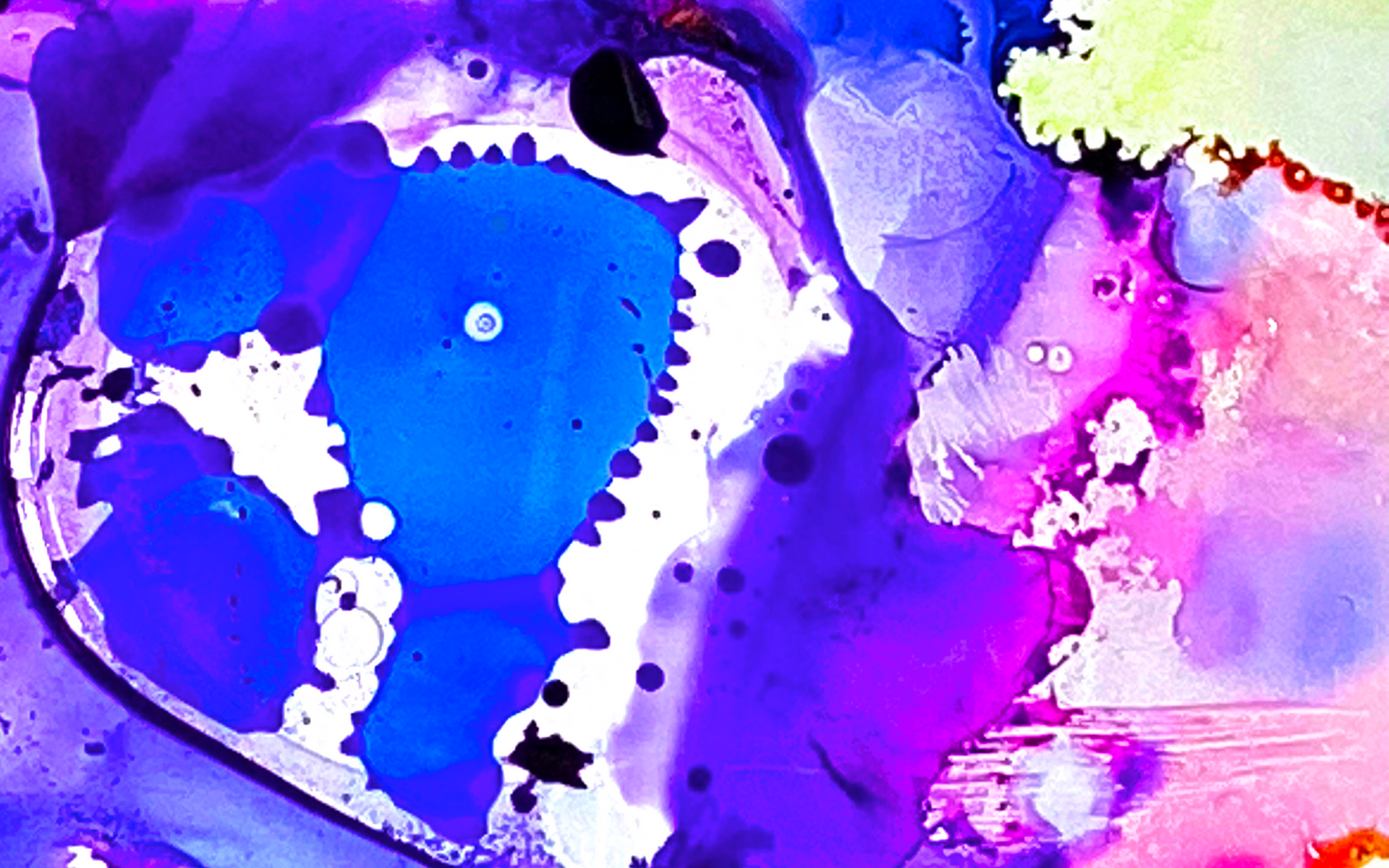
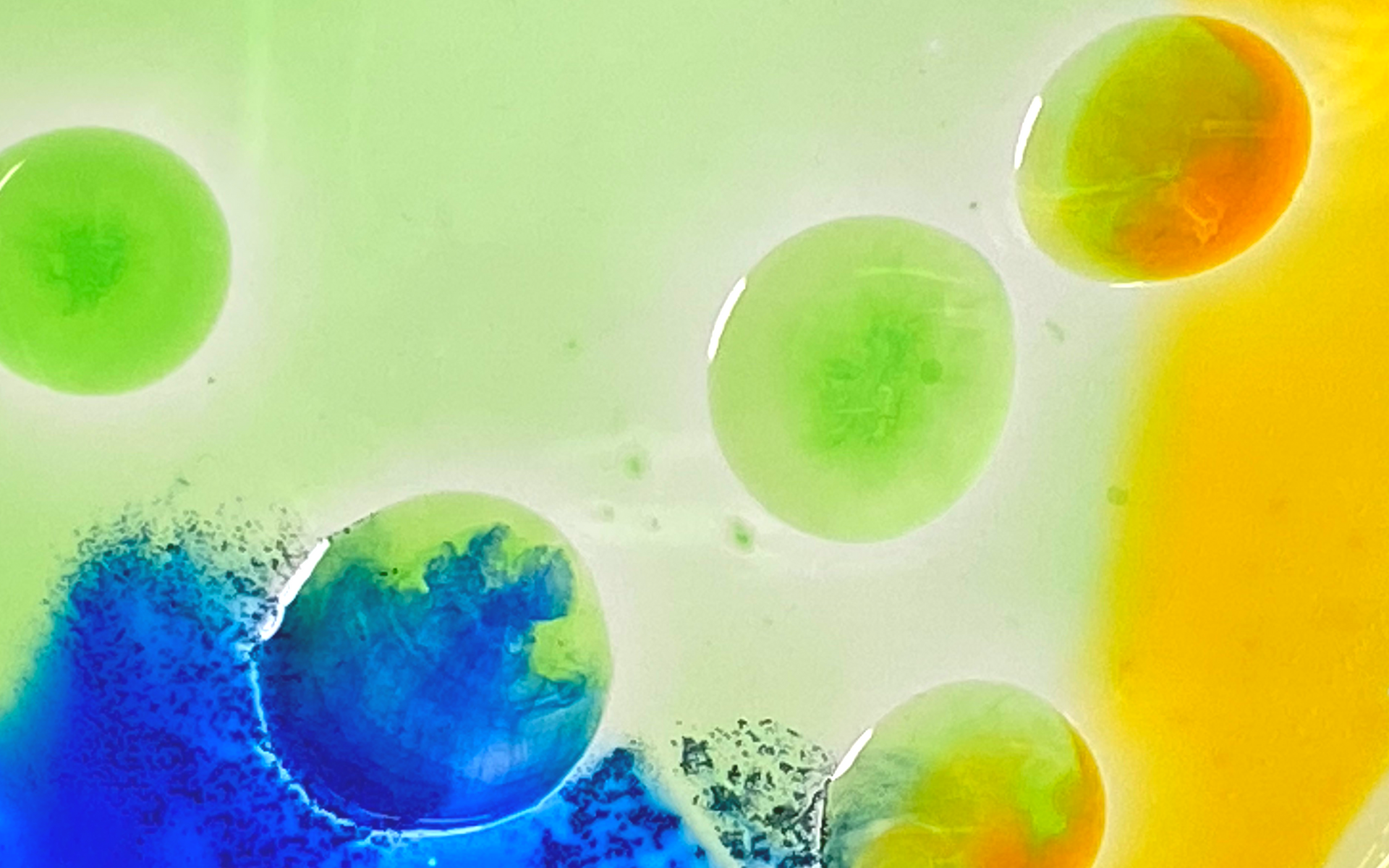
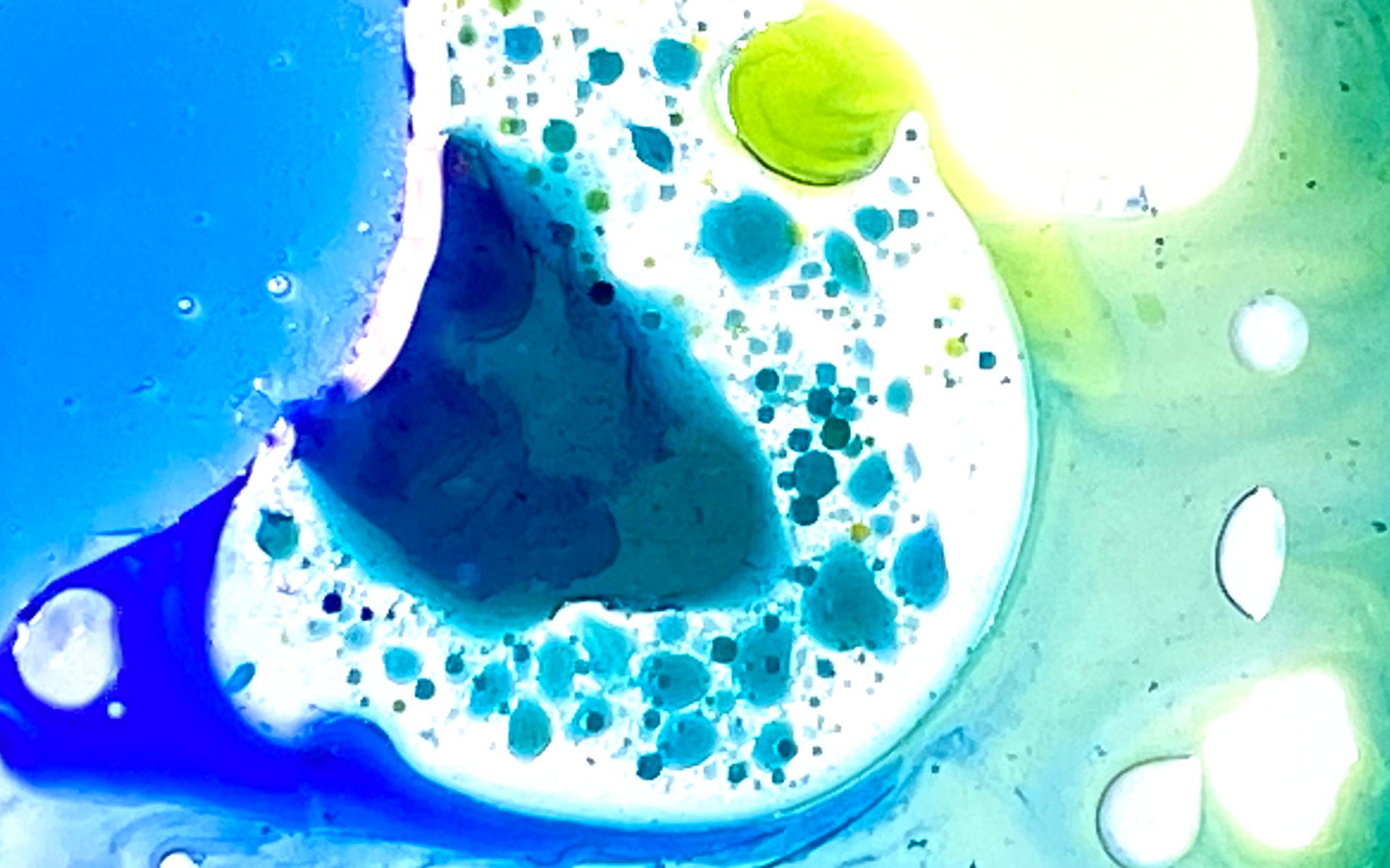
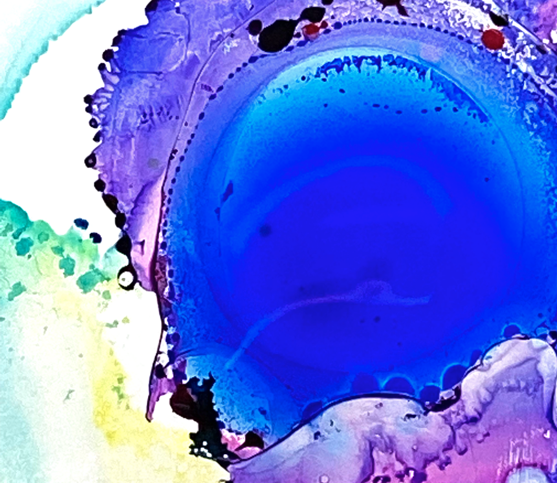
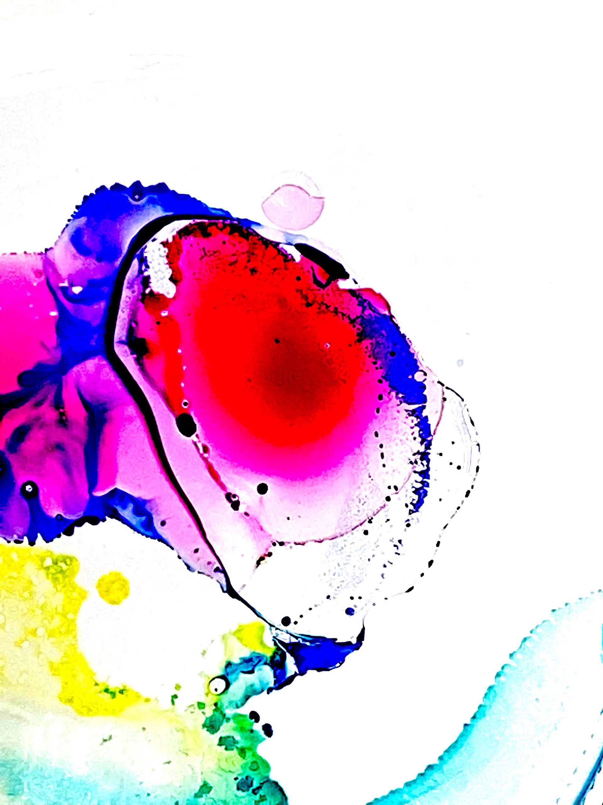
The idea came from the client’s own material. Dye and water in a petri dish, a few drops of baby oil to keep it moving, photographed from directly above. No tripod existed then that would hold a camera parallel over a dish, so I built one. All of it shot on a phone.
That is the merger, happening in front of you, in the medium the company actually works in. The metaphor and the material are the same, which is why it never reads as decoration.
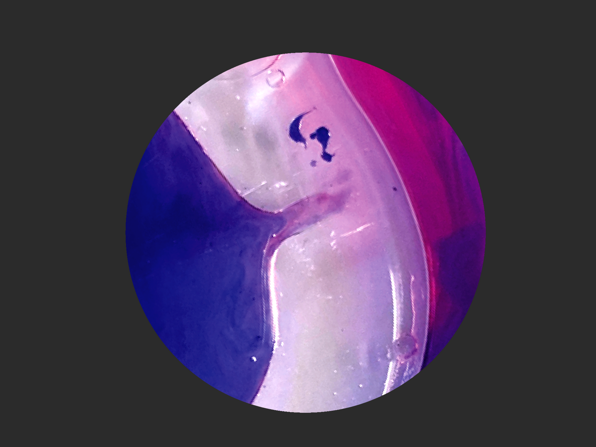
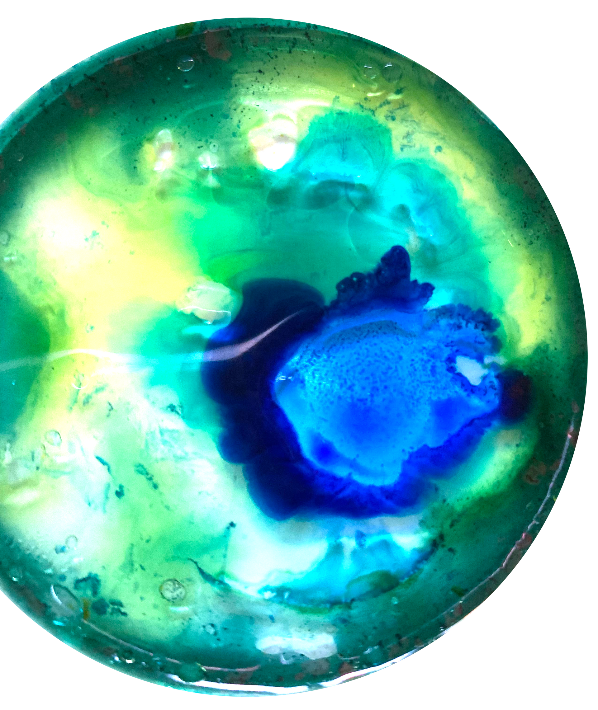
The petri dish is already a circle. What the brand system demanded and what the material naturally was turned out to be the same shape, so the crop was never a compromise. Everything outside the rim came away, the tape and the table and the evidence of a kitchen, and what was left was the event itself.
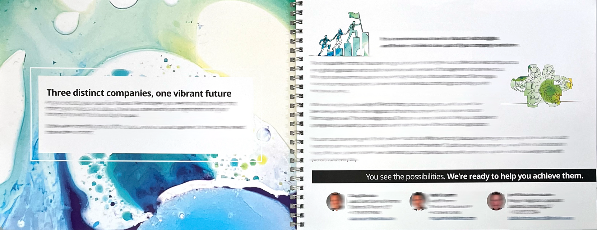
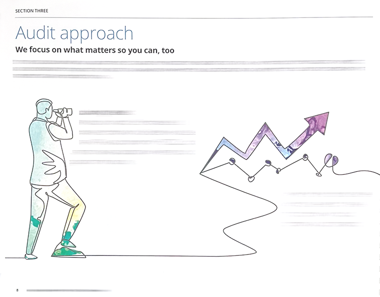
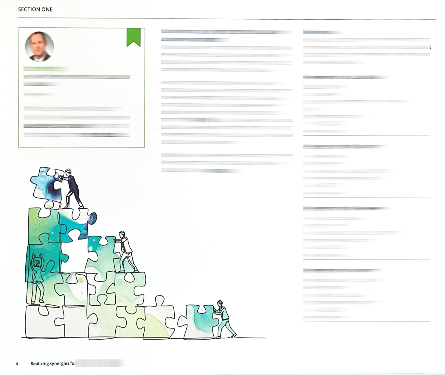
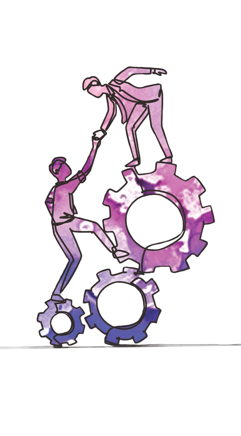
From there it became a system. The photography was composited into illustration and stock, so borrowed material carried the same color running through it and nothing on the page looked bought. Those images became the visual backbone of the proposal, art directed across covers, spreads and section dividers.
Every name, face and line of copy in the Deloitte work shown here has been replaced or obscured. What survives is the design, which is the part I can show you.
THE CENTERPIECE
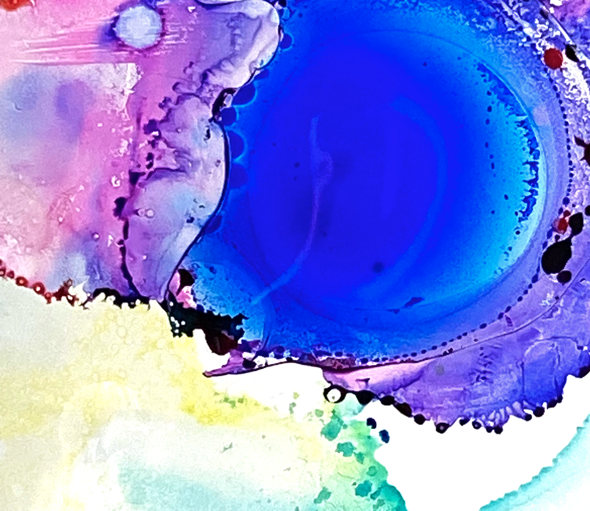
Two substances meeting, caught at the moment they stop being two.
What made it hard
A company arriving at market as a single organization, built out of separate ones, each bringing its own depth. It needed a proposal that carried the weight of all that expertise and the confidence of something already whole.
Nothing off the shelf could do that. Generic imagery would have said the opposite of what the company was claiming about itself.
constraints
The picture everyone already uses
Borrowed material announces itself
The brand ran on circles
What the crop removed
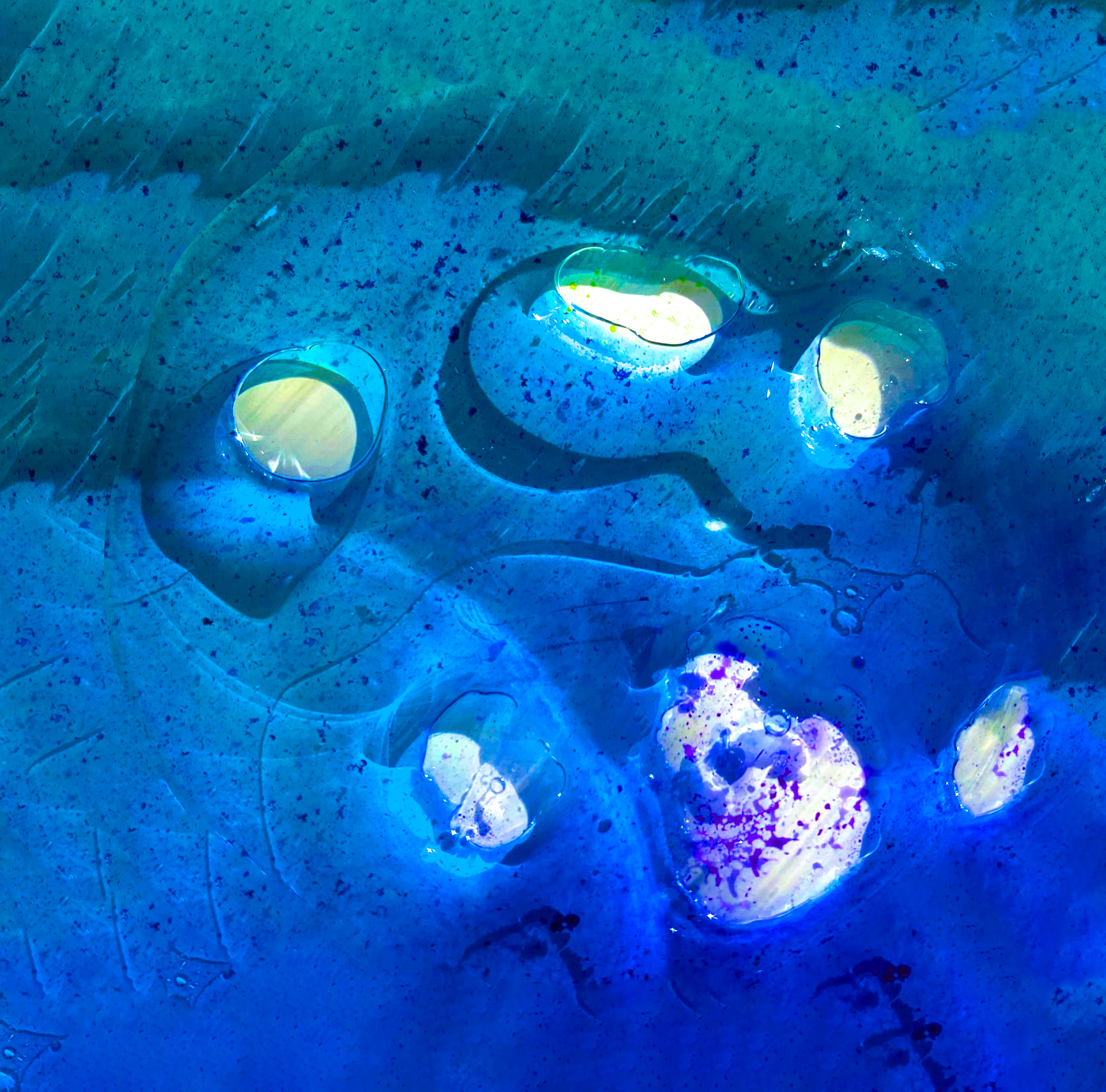
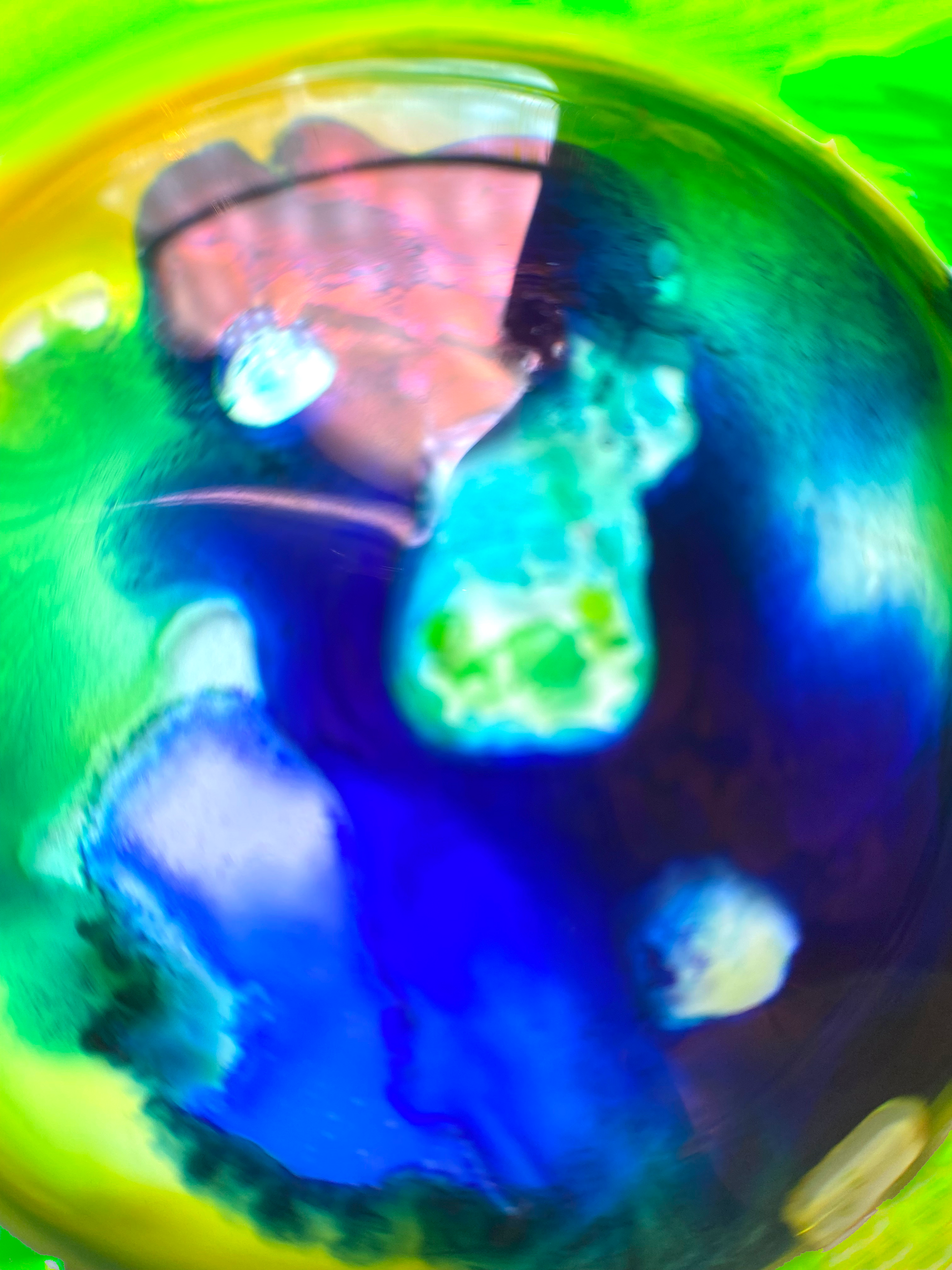
The raw capture and the finished artwork are the same photograph. Everything between them is subtraction.
CREATING
Dyes, water, baby oil, and a white table.
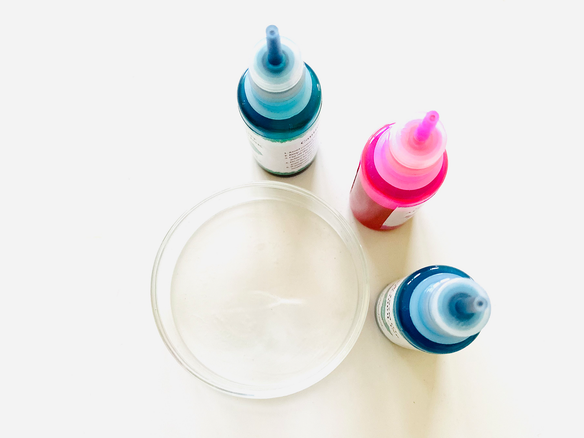
AS CAPTURED
Dish rim, tape, white table, kitchen light. A phone held over a petri dish.
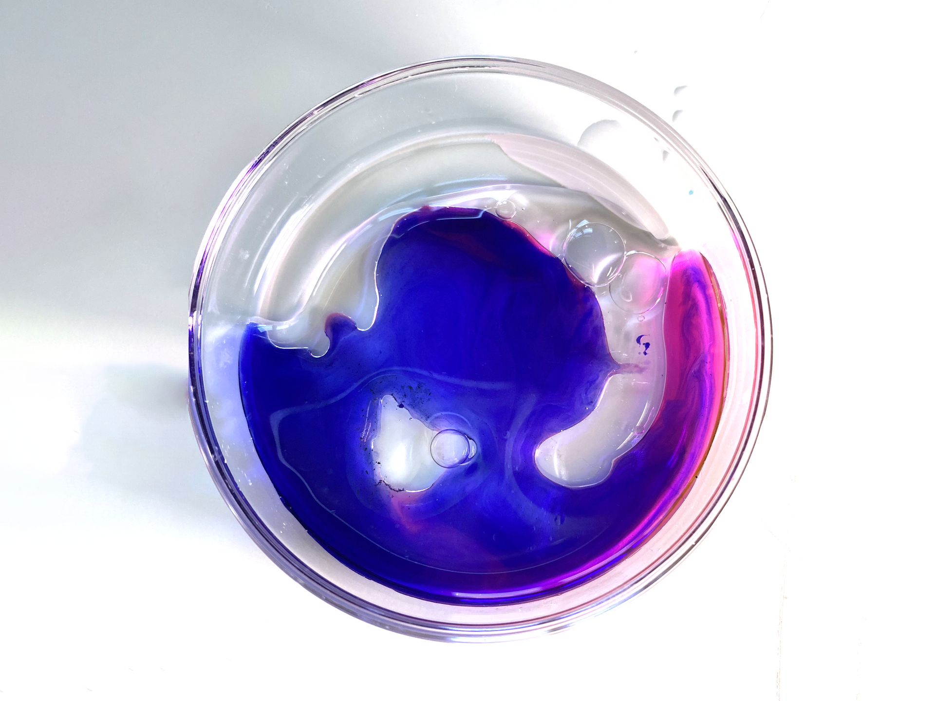
AS PUBLISHED
Everything identifying it as a kitchen removed. What is left is the event.
What lasted
The client response was strong and the approach landed. The longer impact happened inside the firm. Shooting product and process to make proprietary imagery became a practice other teams adopted for their own pursuits, across the country.
The prints were striking enough that several now hang framed. Some work outlasts the thing it was made for. This did.
The constraints were specific to that pursuit. The way of working was not. Finding the idea inside what the business already makes. Shooting it myself rather than buying it. Making every borrowed element belong. That is still how I work.
This is how I work with founder-led businesses now. An in-house creative director, without the cost of hiring one.
Not meant for anyone else.
Brand, website and systems built for your business and no one else’s.