PURSUIT | DELOITTE
At the Speed of Sport
The client gave us their entire image library and full permission to use it. That was the obvious move, and the wrong one.
ROLE
Creative direction, art direction, illustration, design team direction
DELIVERED
A pursuit at this level ran six months to a year and produced a system, not a document. A custom illustration system, pursuit communications produced across the full year, and the proposal itself.
The Work
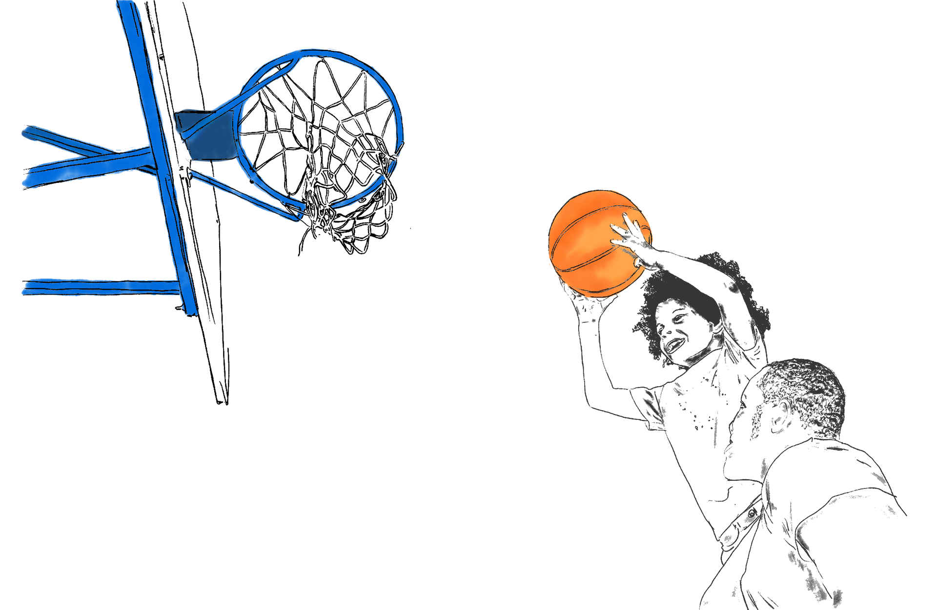
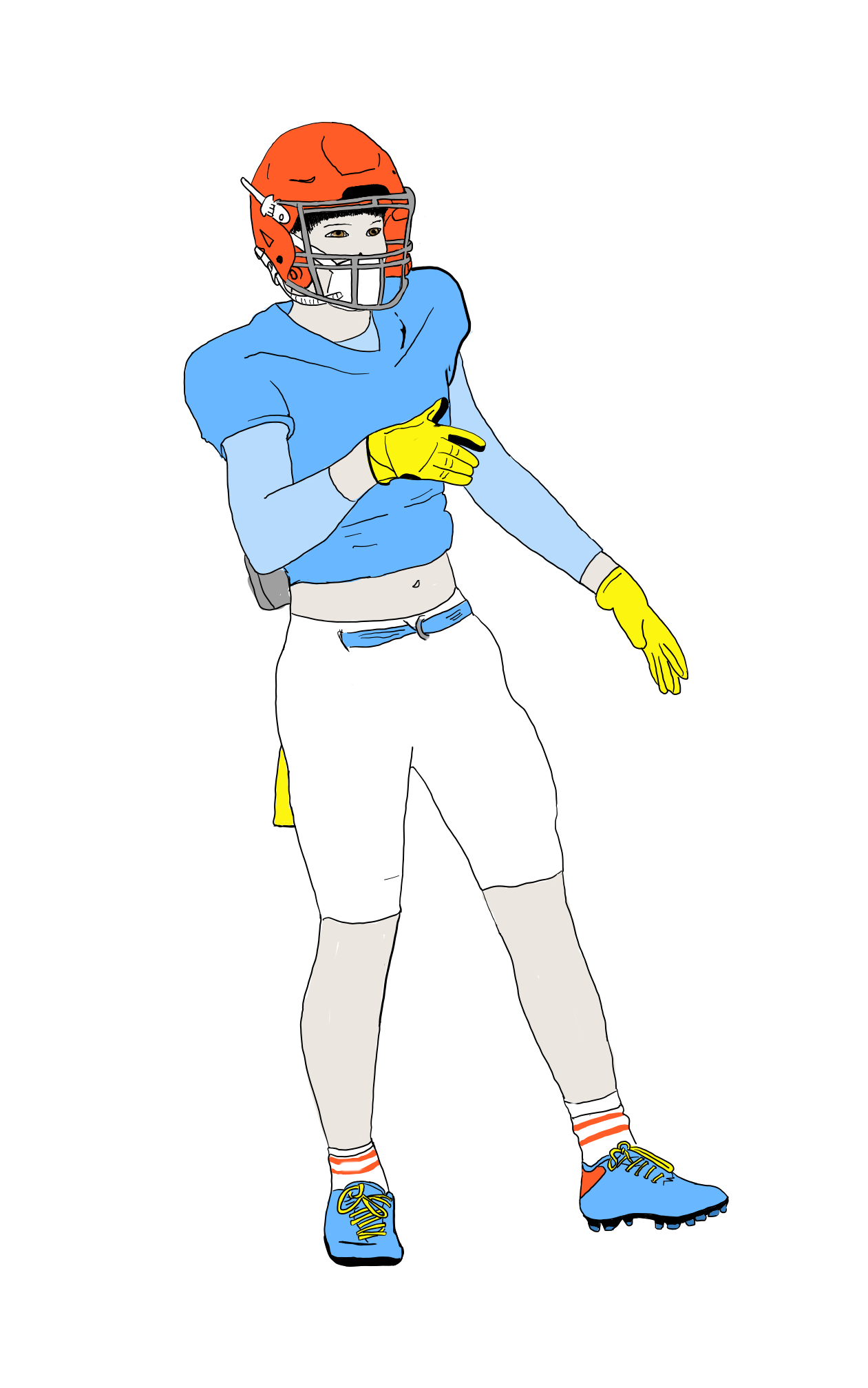
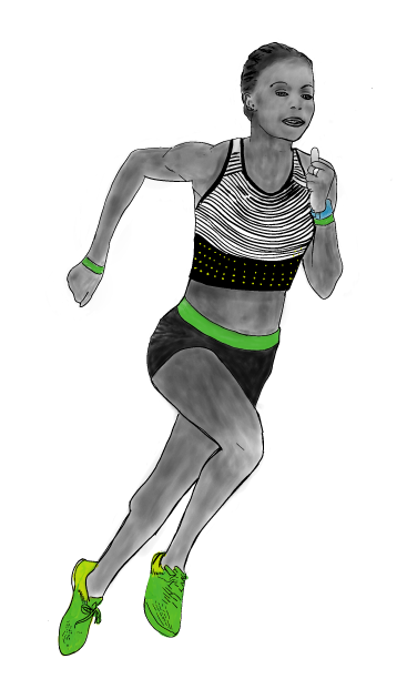
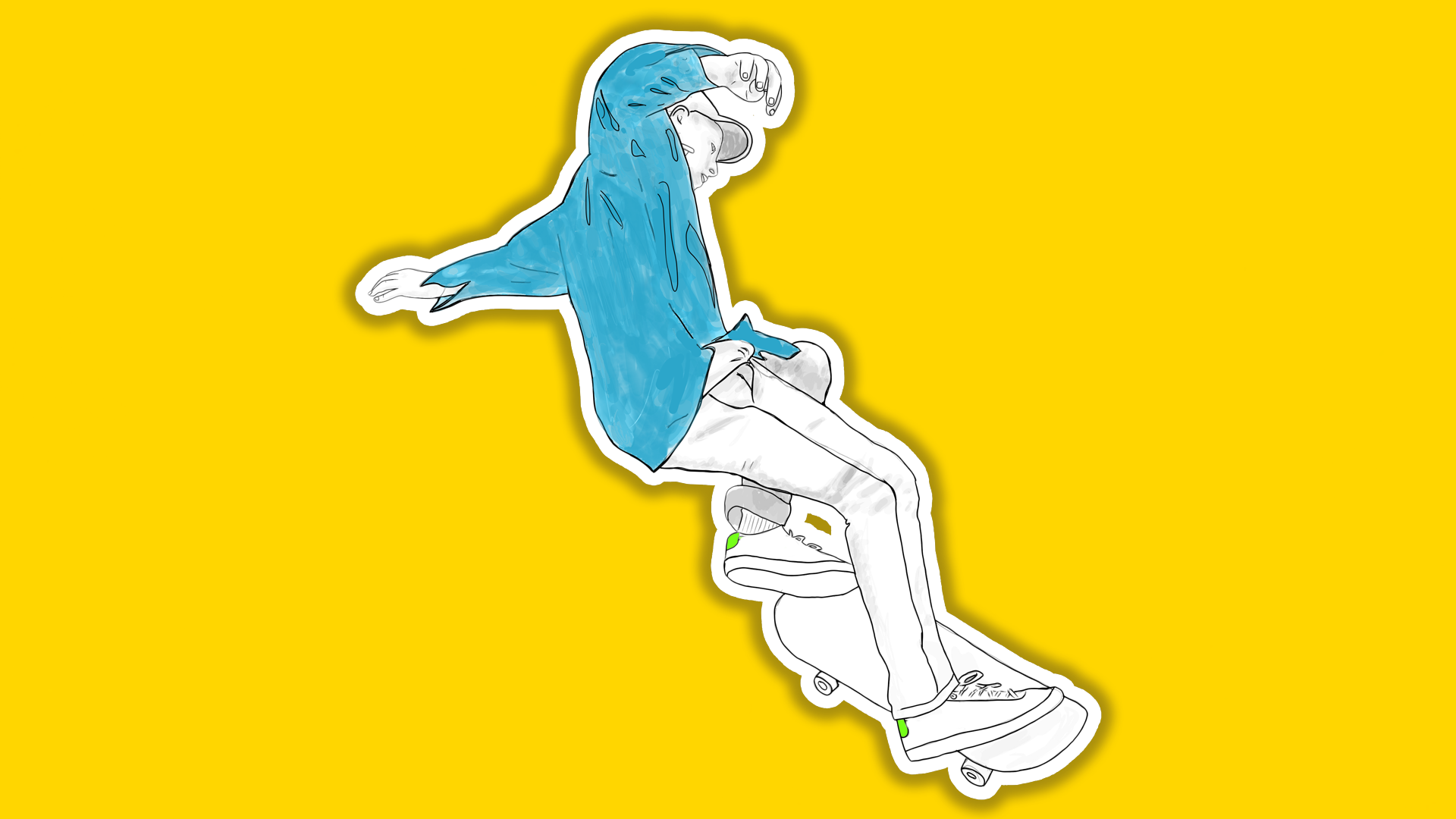
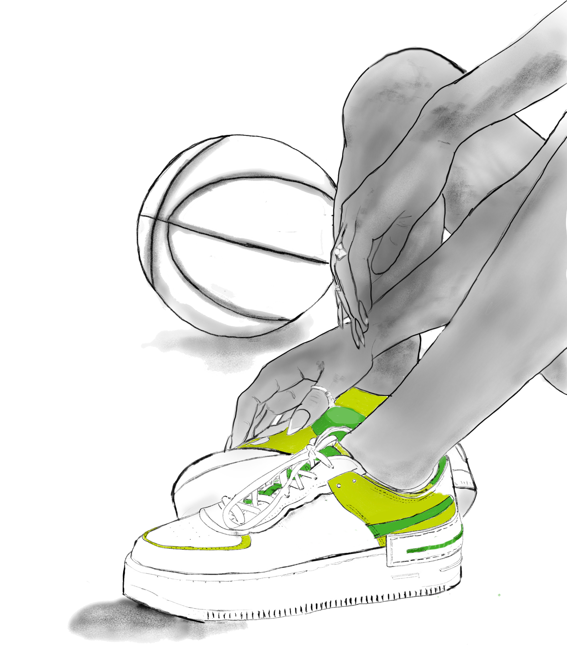
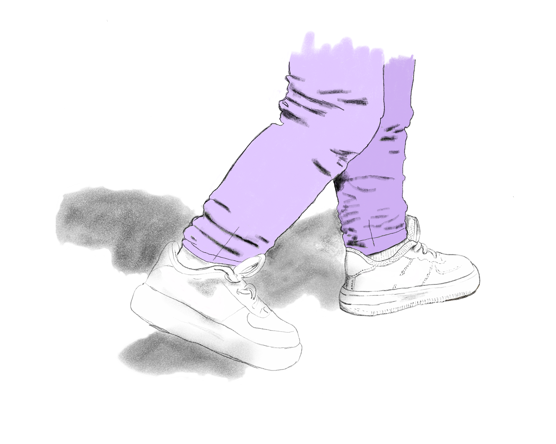
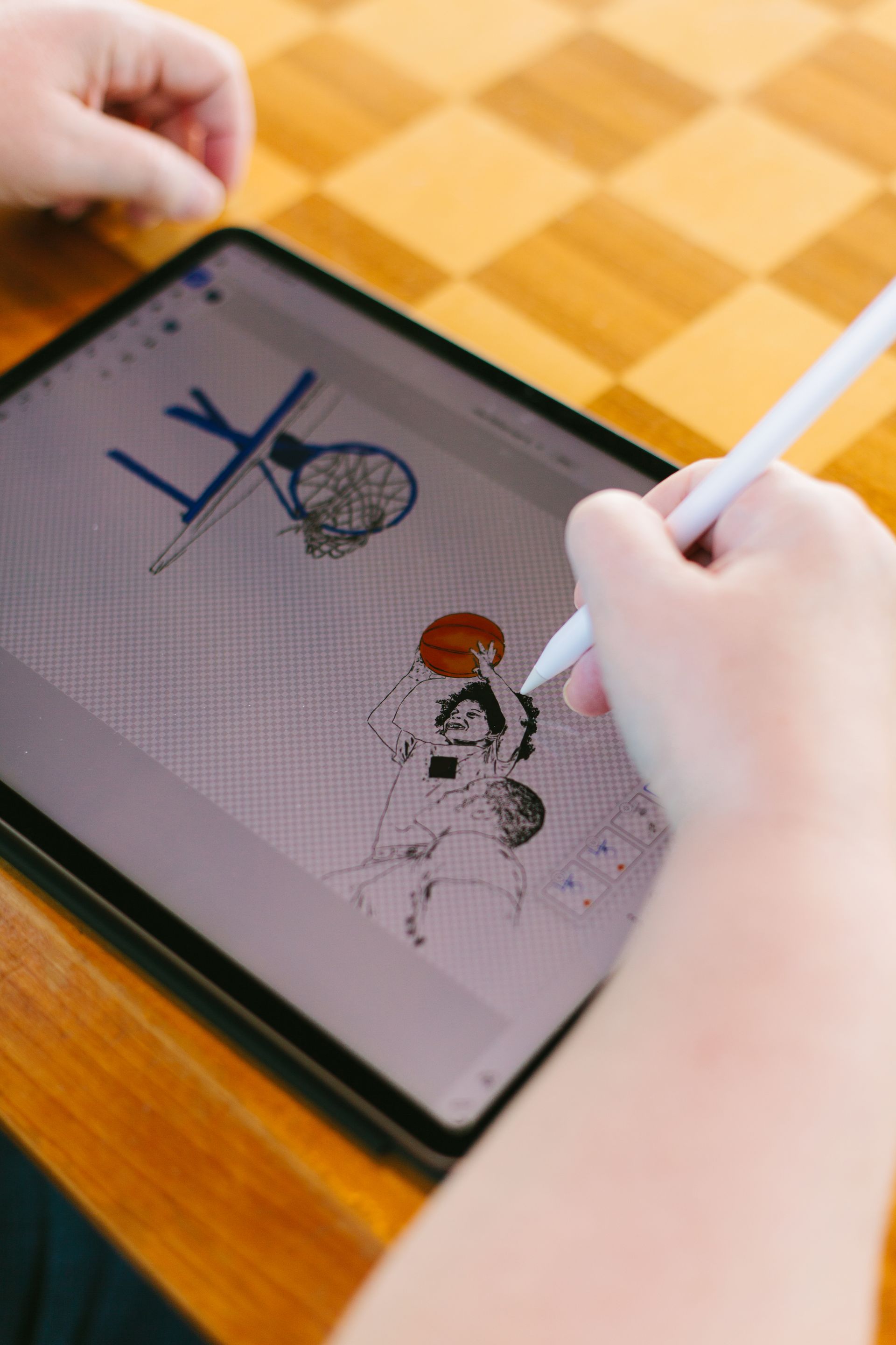
So I drew it instead. More illustrations than I can count. Athletes, movement, the specific physics of a body doing something difficult, built as a system rather than a run of one-offs, so a new piece could be made in the same hand at any point without starting over.
Because the drawings existed nowhere else, nothing in the pitch could be matched by someone shopping the same library. And because a drawing is understood to be an interpretation, it could carry the brand's attitude and its love of sport without making a claim about a product that could be checked.
The work went in front of several layers of leadership every two weeks, partners with long relationships with the client and firm views about what would and would not fly. A look that survives that many opinions cannot be held together by taste. It needs rules other people can follow, which is what makes it a system rather than a style.
The illustrations went on to brand our communications with the client across the full year of the pursuit.
Every name, face and line of copy in the Deloitte work shown here has been replaced or obscured. The illustrations carry no trace of the brand itself. What survives is the design, which is the part I can show you.
THE CENTERPIECE
Material that belongs to everybody cannot say anything about anybody.
What made it hard
Three problems, and they pulled against each other. The client's own library was there and we were welcome to it, but so was every competitor pitching, and stock was out for the same reason. This is a brand people already hold a picture of and hold precisely, so a wrong detail would not read as a bold choice, it would show we did not know them. And it had to hold across different bodies, different equipment and completely different physics, and still read as one hand.
constraints
The easy answer was already approved
Wrong would have been worse than dull
It had to cover every sport, not one

What lasted
The direction was backed unanimously by the partners closest to the client, the people with most to lose if it had misread them. That is the part worth keeping. The whole risk of the approach was getting a beloved brand wrong, and the people best placed to judge said it was right.
The constraints belonged to that pursuit. The method did not. When everyone can buy the same picture, the only durable advantage is making one. And when what you make has to hold across dozens of pieces and several hands, it has to be built as a system rather than a style. That is still how I work.
This is how I work with founder-led businesses now. An in-house creative director, without the cost of hiring one.
Not meant for anyone else.
Brand, website and systems built for your business and no one else’s.