PURSUIT | DELOITTE
Precision Under Pressure
A relationship measured in generations, a cover image I did not choose, and a client who had already decided what design was for.
ROLE
Creative direction, art direction, photography, illustration, print production
DELIVERED
A pursuit at this level ran six months to a year and produced a system, not a document. Websites, printed books, digital delivery, presentations, a constant stream of meeting materials, and pieces that had no precedent.
The Work
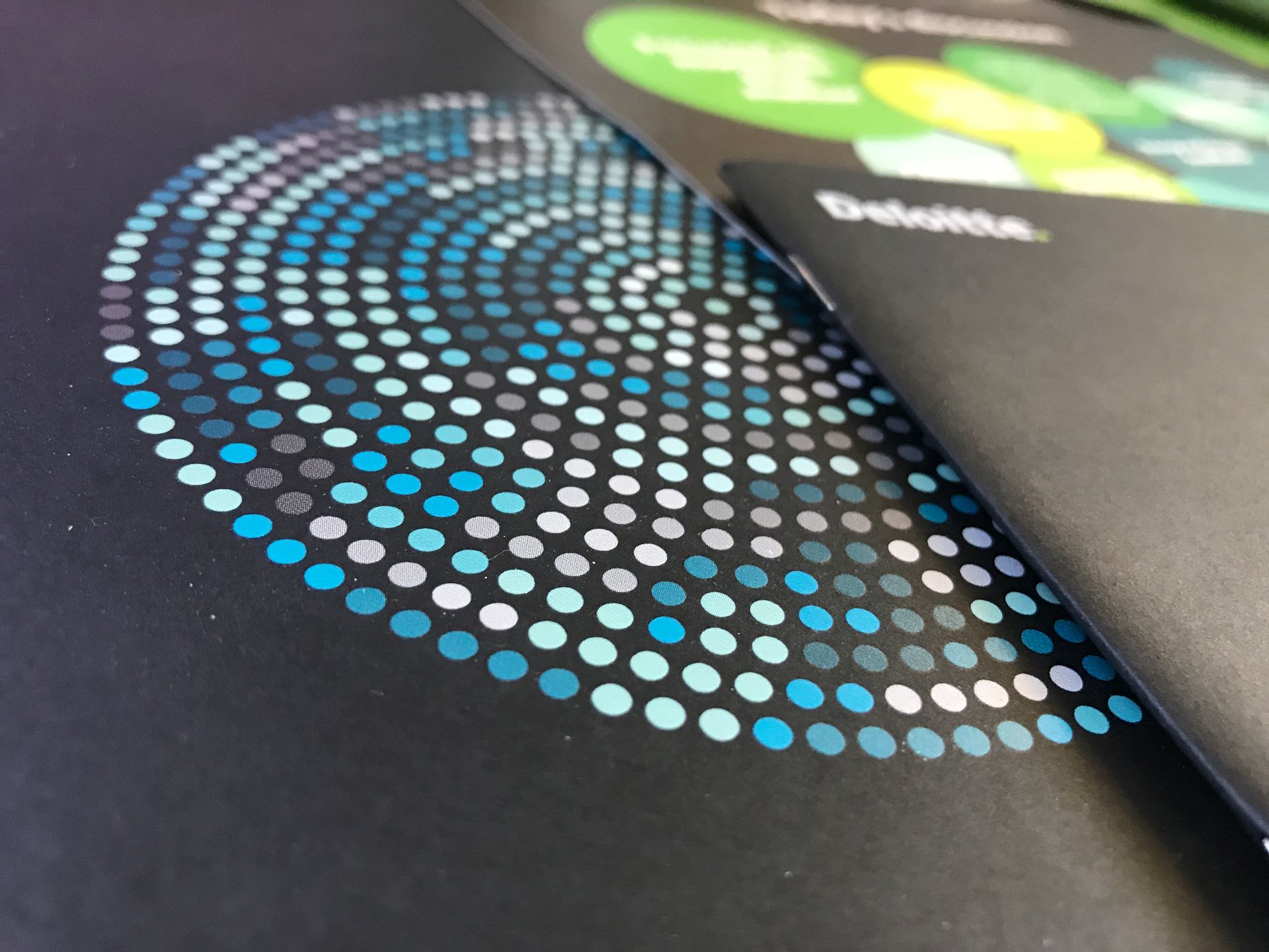
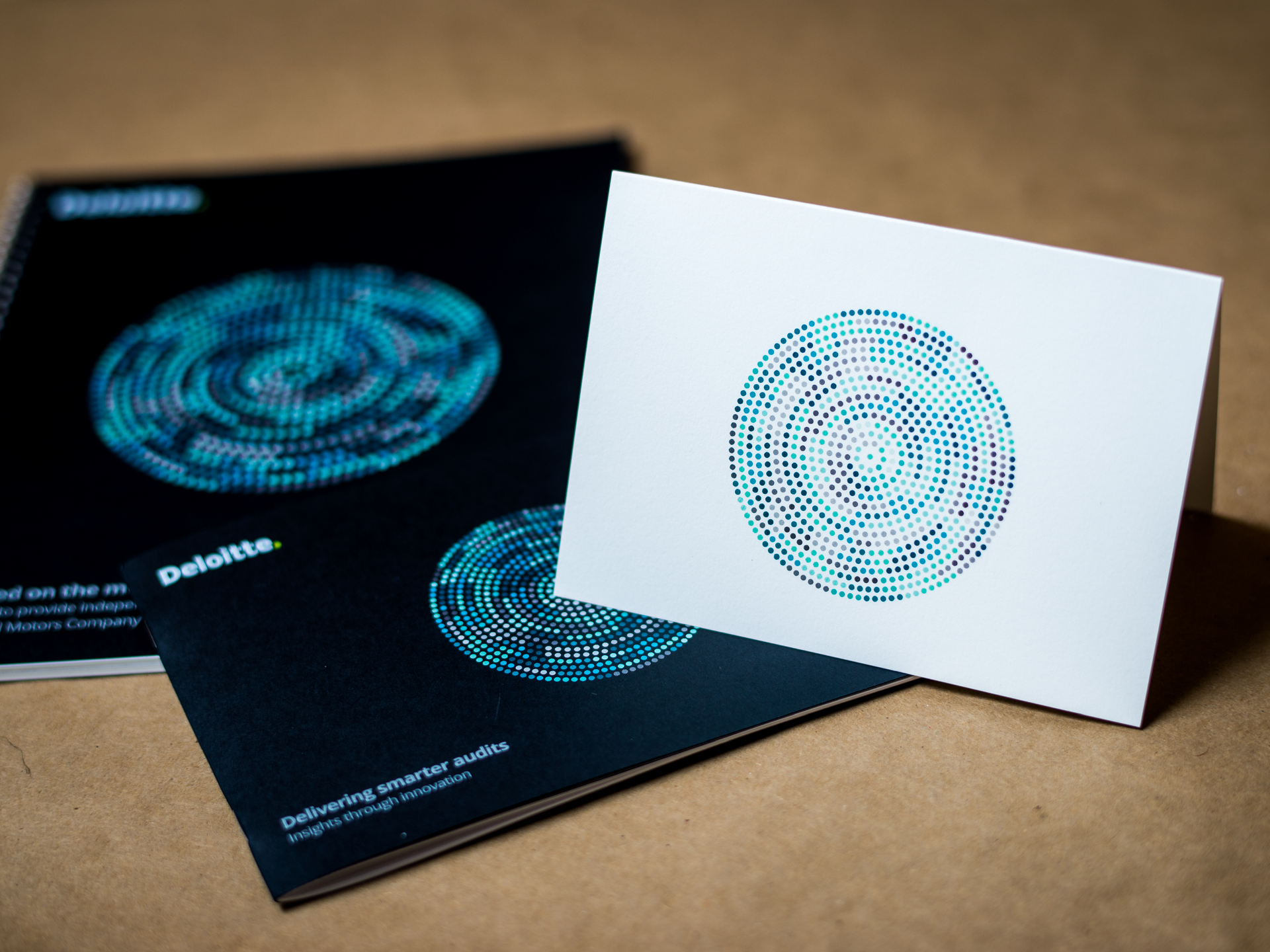
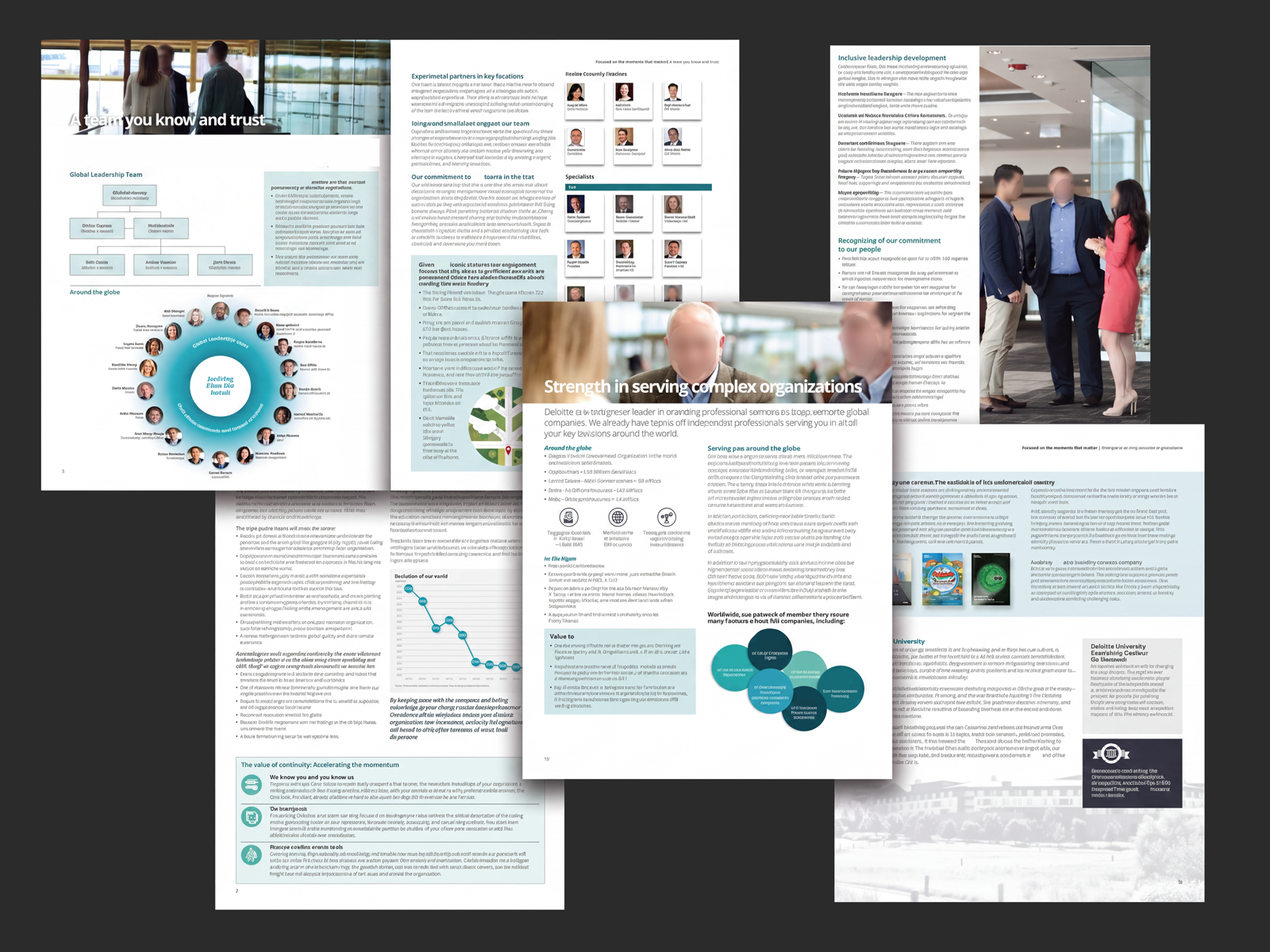
The cover image, a field of concentric circles graduating from opalescent white at the center through teal and blue out to charcoal, was rebuilt entirely from scratch in Adobe Illustrator. What had been a flat reference became a production piece of quiet precision: opalescent ink for the whites, silver metallic ink for the grays, select circles embossed for dimension and touch. The stock was sourced specifically: a smooth, solid black uncoated cover, bound in silver. Every material decision was intentional. Every conversation with the printer was earned over days of refinement.
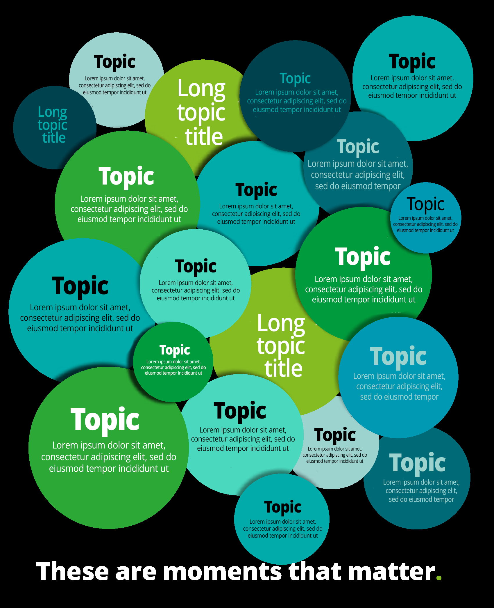
Inside, the visual language opened up. The interior front cover became a choreography of overlapping circles in teal, blue, and green, each sized in deliberate proportion to the priority of the content it carried. Information architecture expressed as design. “These are moments that matter.” anchored the spread.
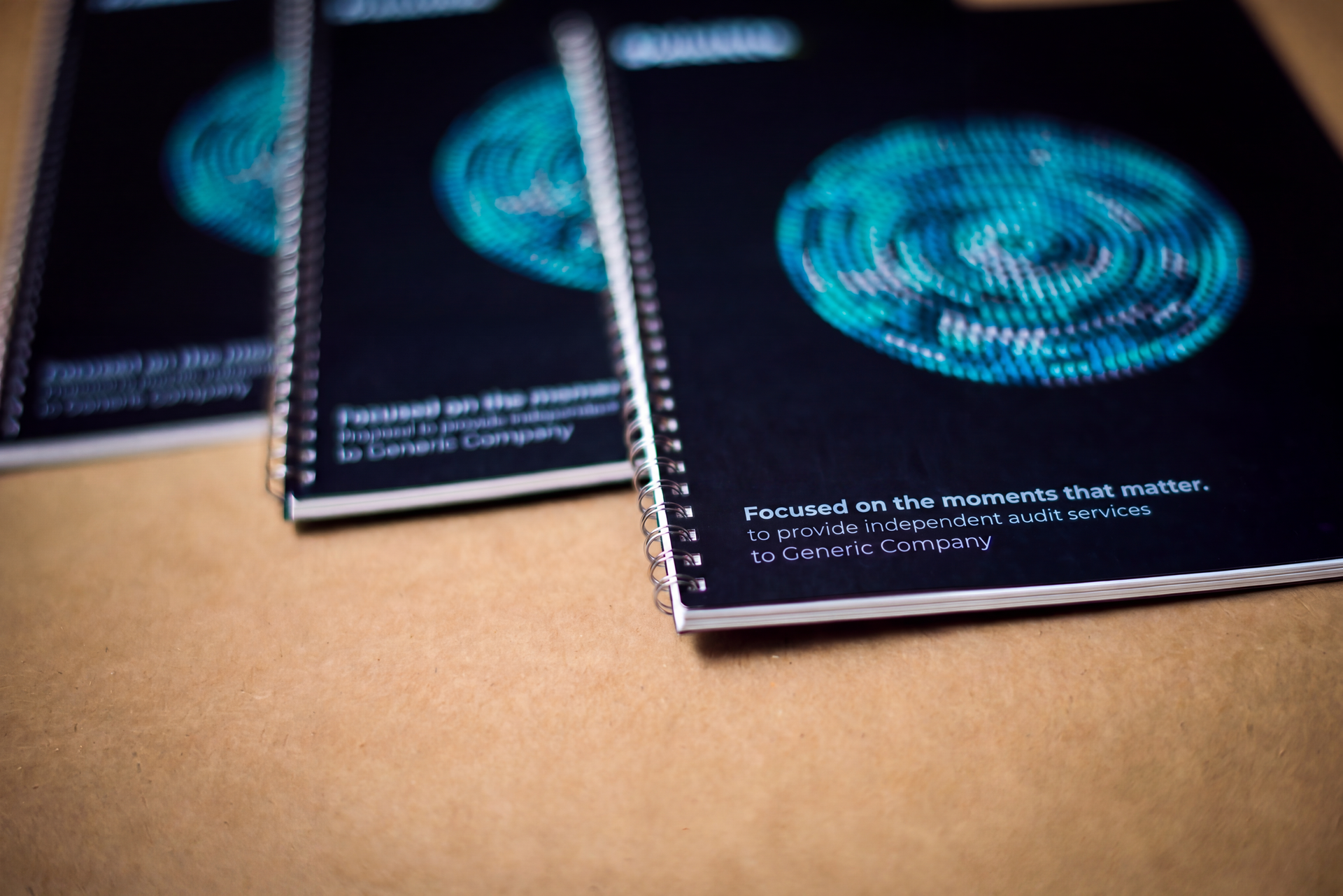
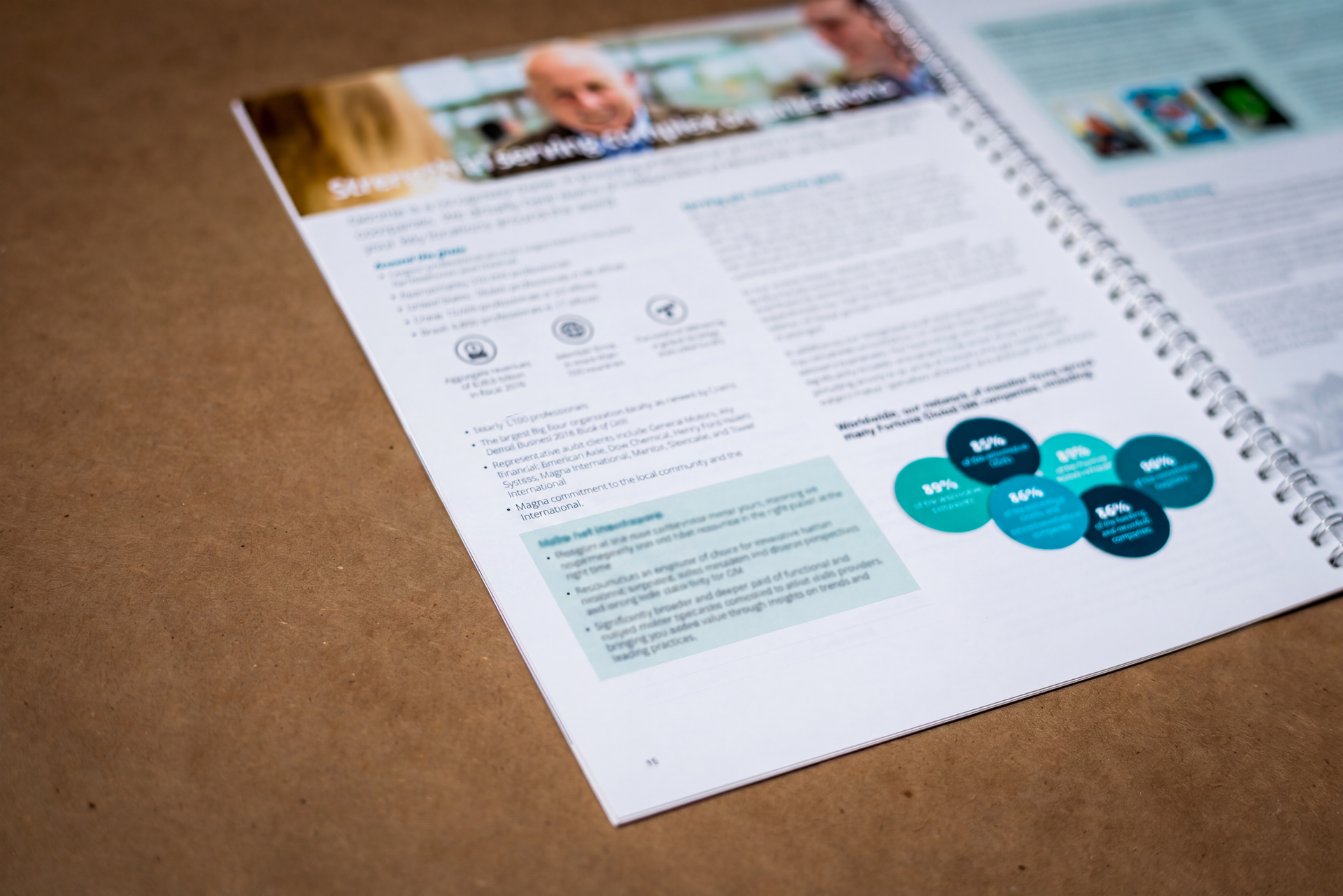
I brought in a photographer to create a complete library of branded imagery for the pursuit: portraits, candid moments, and environmental shots that could be deployed across the entire document. Every image was art directed to ensure visual consistency and strategic alignment. The result was a proposal built entirely on original assets rather than stock photography. Imagery as intentional as the message itself.
Every name, face and line of copy in the Deloitte work shown here has been replaced or obscured. Henry Phillips approved the use of his name and his quote. What survives is the design, which is the part I can show you.
THE CENTERPIECE
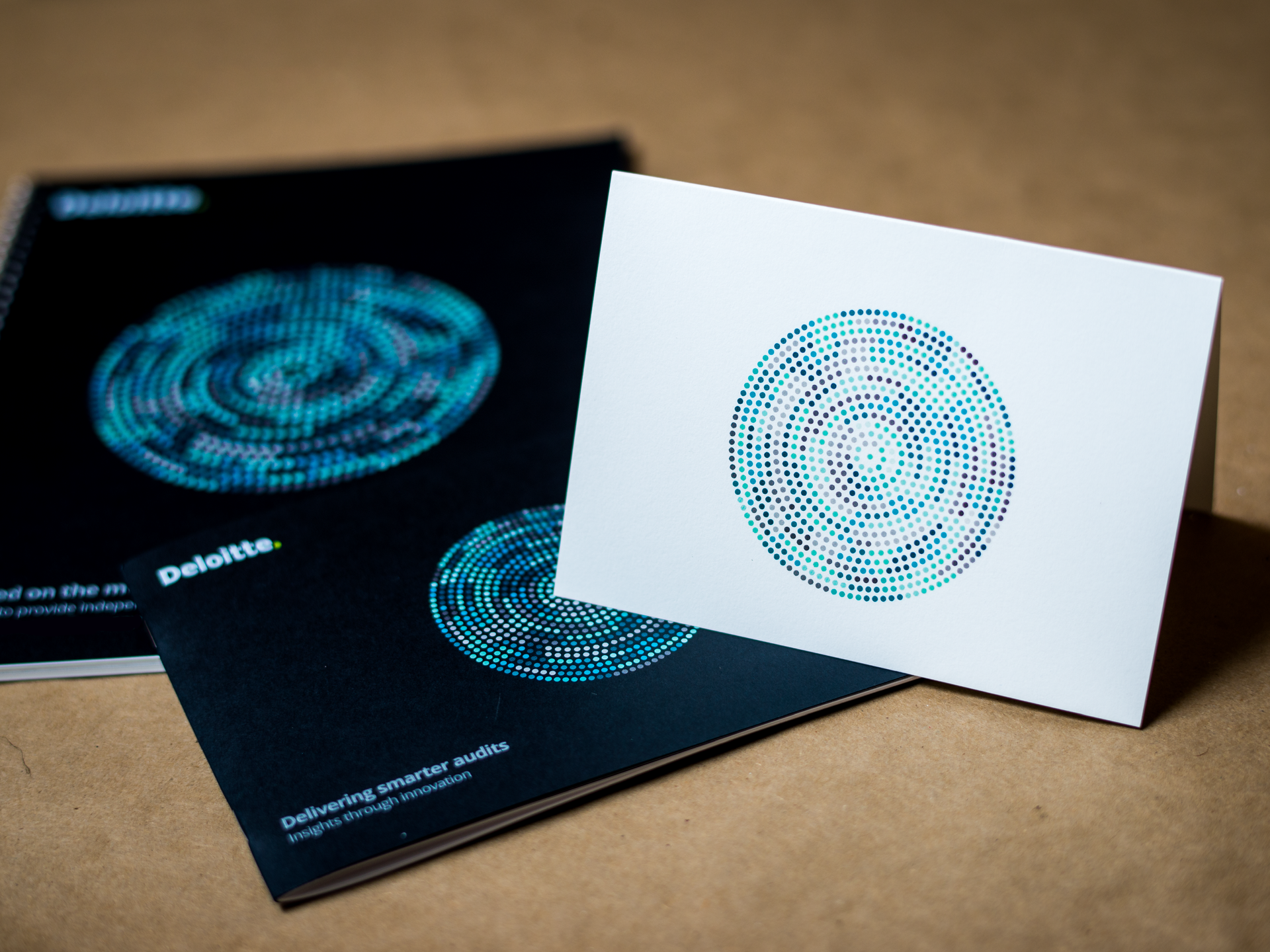
The custom photography carried through the full year of the pursuit.
What made it hard
The firm had audited this company for generations, so embedded that it had moved an office into the client's own building. Nothing about us could possibly look new.
Then the brief arrived with the cover image already chosen, the printing fixed at two colors and double sided, and four lines of art direction. That is not a printing preference. It is a statement that design is an expense to be managed.
constraints
The image was already chosen
Limit colors, two or three
Simple. Short.
No gimmicks or complicated graphics

“Just when I think we’ve pushed the limits on creativity and innovation in our pursuit process, Brooke pushes us further—leading to new ways to differentiate us from our competition.”

Henry Phillips
Pursuit Lead Client Service Partner
Vice Chairman & National Managing Partner, Center for Board Effectiveness, Deloitte
What lasted
The pursuit advanced deep into the process. The work was strong. The relationship was stronger.
When it concluded, the cover was framed and sent to Henry Phillips. He loved it.
Some work outlasts the result it was made for. This was that.
The constraints were specific to that pursuit. The way of working was not. Building a system rather than a document. Directing photography instead of buying it. Standing in a print shop until the ink is right. That is still how I work.
This is how I work with founder-led businesses now.
An in-house creative director, without the cost of hiring one.
Not meant for anyone else.
Brand, website and systems built for your business and no one else’s.