Phase 1: Brand Foundation
Building credibility and scalability from the ground up
When I began working with Balance Yoga Barre in late summer 2023, they had something precious: a deeply loyal community who loved their classes and instructors. But the visual identity couldn't carry that energy beyond the studio walls. The logo felt homegrown, the brand materials were inconsistent, and there was no clear system for how BYB should show up as they considered expansion.
The challenge wasn't to erase what made them special—the warmth, the approachability, the genuine sense of belonging. It was to bottle that energy into a brand system professional enough to support growth while maintaining the soul that made people fall in love with BYB in the first place.
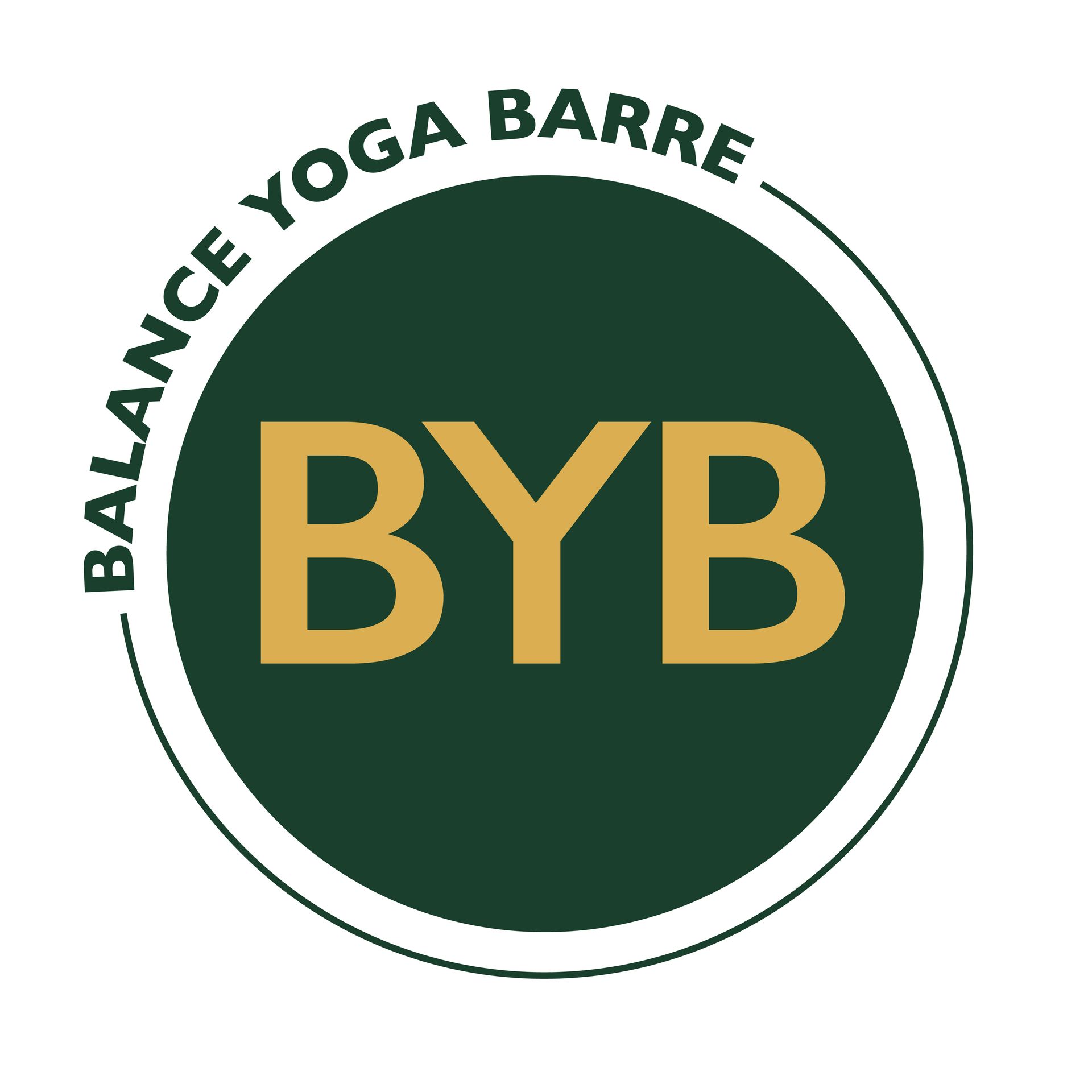
We started with the logo itself. Chris Province, the owner, wanted something that felt both established and energetic—masculine enough that men joining classes didn't feel like they were walking into a "women's only" space, but still welcoming and warm. The solution balanced those competing needs: a circular mark in deep emerald and gold that borrowed visual authority from heritage fitness brands while the hand-drawn quality of the letterforms kept it approachable.
The color palette told its own story. That deep green wasn't accidental—it signaled premium wellness, growth, natural energy. The gold added warmth and a hint of aspiration without feeling pretentious. Together, they created a foundation that could work across everything from Instagram posts to physical studio signage.

But a logo is just a mark until it becomes a system. We built comprehensive brand guidelines that established not just what the logo looked like, but how BYB communicated visually across every touchpoint. Typography that felt confident but not cold. Photography direction that captured real bodies doing real work, not Instagram-perfect poses. Graphic elements and patterns that could flex from digital to print without losing their impact.
The positioning strategy was just as critical as the visual work. BYB needed to own a specific space in the market: community-driven premium wellness. Not the cheapest option, not the fanciest gym, but the place where you'd actually want to show up because the people mattered as much as the workout.
As Chris Province describes it: "BYB moved from a position of local studio to scalable wellness company. The visual identity suddenly matched the quality of the in-studio experience."
The brand foundation didn't just make things look better—it established BYB as more than a fitness studio. It became a lifestyle brand with clear values, visual authority, and the systematic thinking required for growth. This wasn't cosmetic. It was the infrastructure that made everything in Phase 2 and Phase 3 possible.
Without this foundation, the website wouldn't have had a coherent voice. The competitive response to PowerLife wouldn't have felt credible. The acquisition wouldn't have happened. Everything that followed depended on getting this part right.
What we built
Complete logo redesign and brand identity system | Visual standards for typography, color, photography, and graphic elements | Positioning strategy that differentiated BYB from boutique competitors and national chains | Brand application guidelines for digital platforms, physical spaces, retail, and marketing materials