SERVICENOW
Built to Ship
Two years of design for ServiceNow’s partner program, the side of the company that works with the consultancies and resellers who bring its software to customers. Program guides, event systems, tier badges and a printed guidebook for Knowledge 2025. Their brand, three time zones, and all of it shipped.
ROLE
Embedded design lead for the partner ecosystem team.
Editorial systems, event graphics, print production.
Working through a former colleague inside the company, in ServiceNow’s brand.
DELIVERED
Ten program guides on one system, plus templates their team still uses.
Five partner events, from meterboards to what people posted afterward.
A 39-page printed guidebook in every partner’s hand at Knowledge 2025.
The Work
It came to me in the studio’s first month, through a former colleague who was already out on her own and later went inside ServiceNow. She sat in the meetings and translated. I made the work. It was a world I already knew. I speak corporate: the deadlines, the comms, the approvals across time zones, the brand you do not get to argue with.
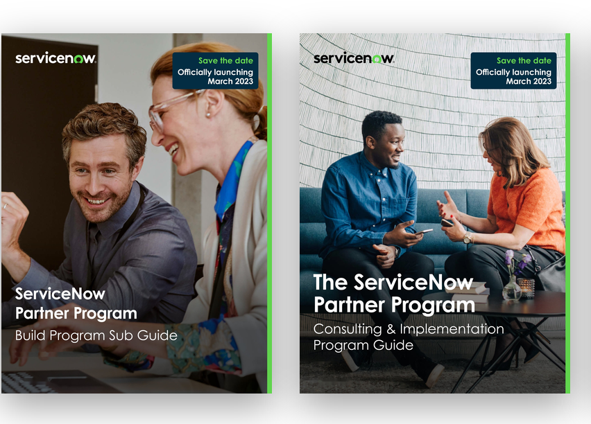
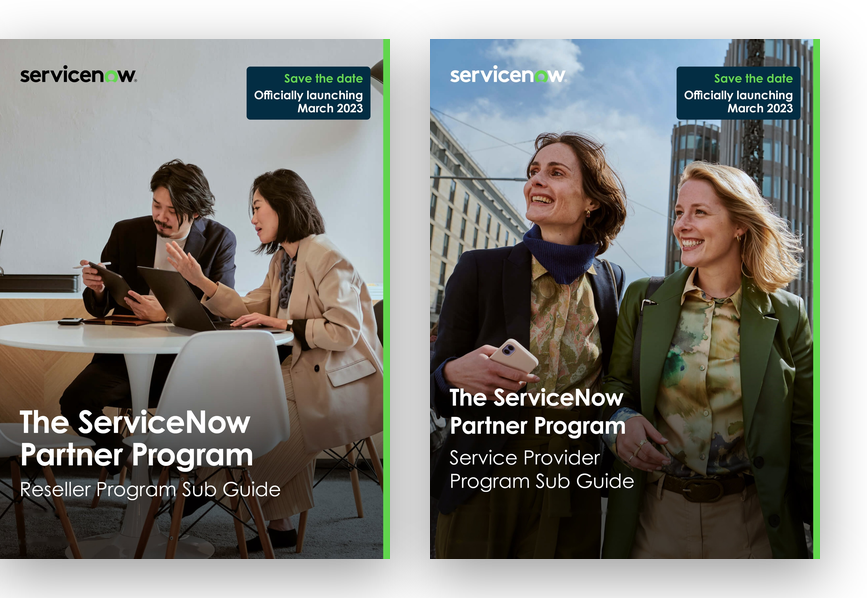
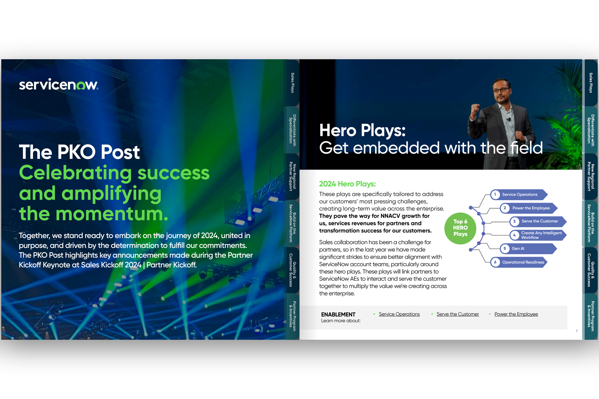
The documents came first. ServiceNow had just relaunched its Partner Program, and a program that size runs on guides, one for every track. I designed the editorial system, built all ten on it, then built the templates so the team could make the next one without me. They did.
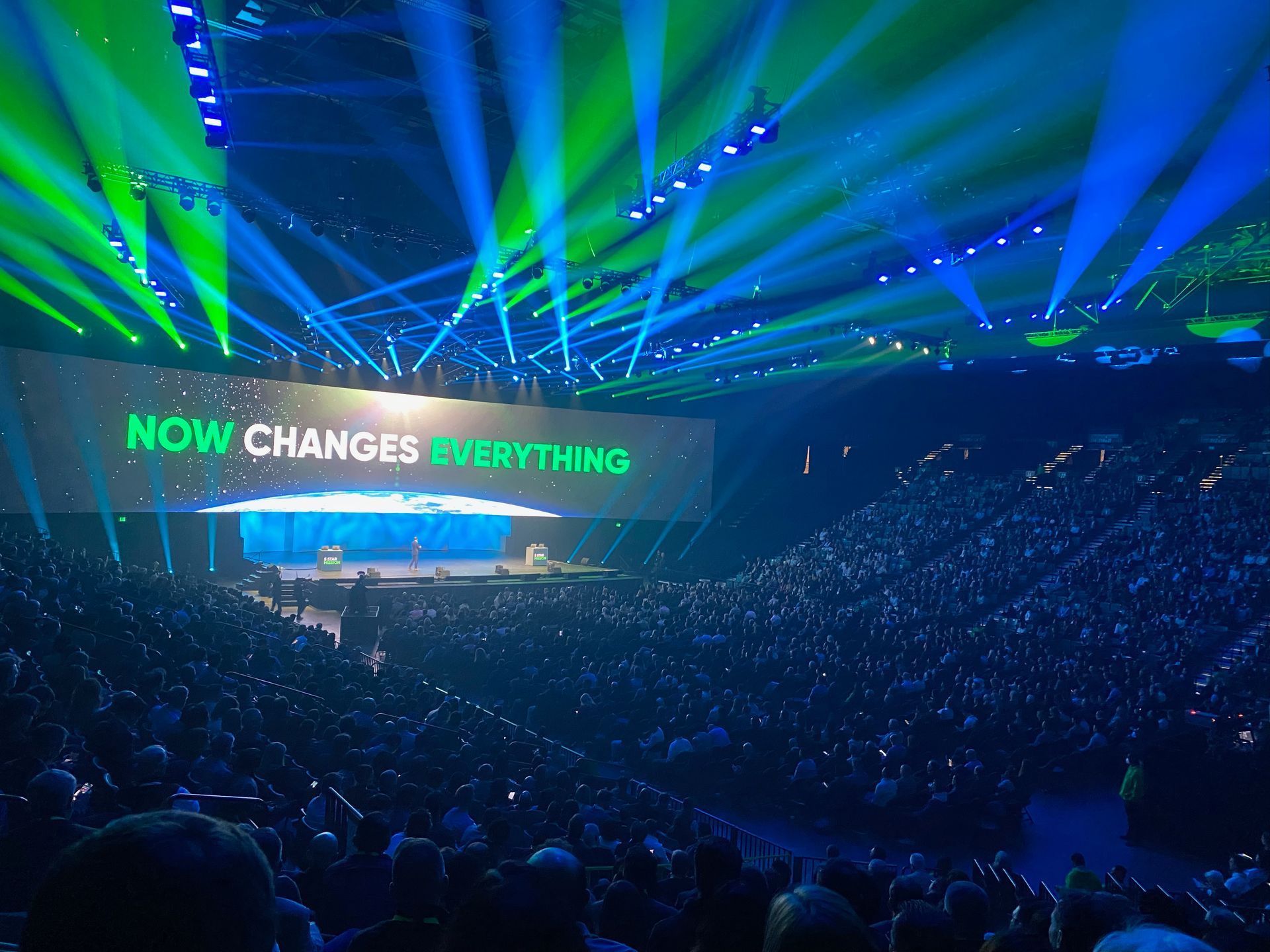
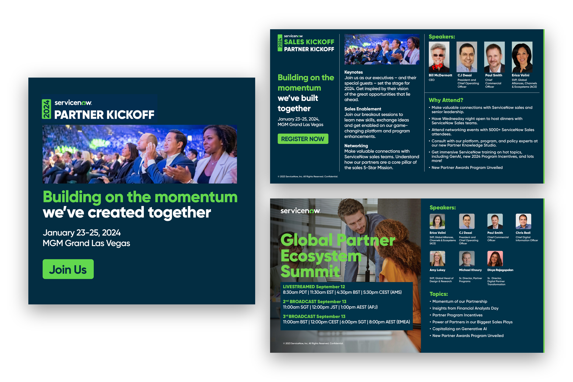
Then the events. A summit broadcast to three continents, where one system had to hold from the meterboards in the room to the cards partners posted the next morning. A kickoff, a regional summit in India, a social kit for Zurich, the tier badges partners put on their own sites, banners for the portal. Their typeface, their green, their photo library. My hierarchy, my grid, my structure inside it.
And in the spring of 2025, the book: a 39-page guidebook for the partner day at Knowledge in Las Vegas. Venue map, agenda, eight chapters with pro tips and activities, notes pages, a four-cover system. Thirty-one rounds of edits. Printed and on the tables when the doors opened.
THE CENTERPIECE
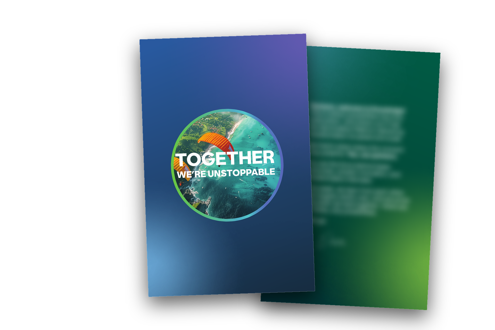
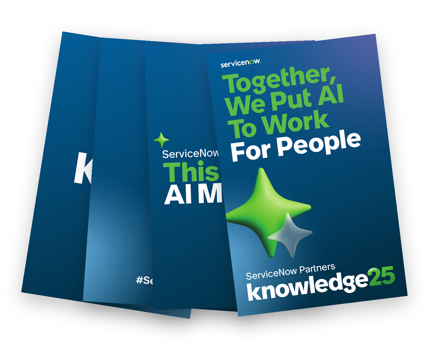
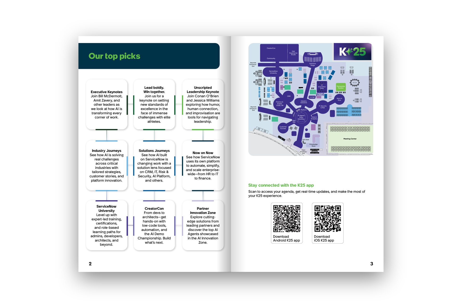
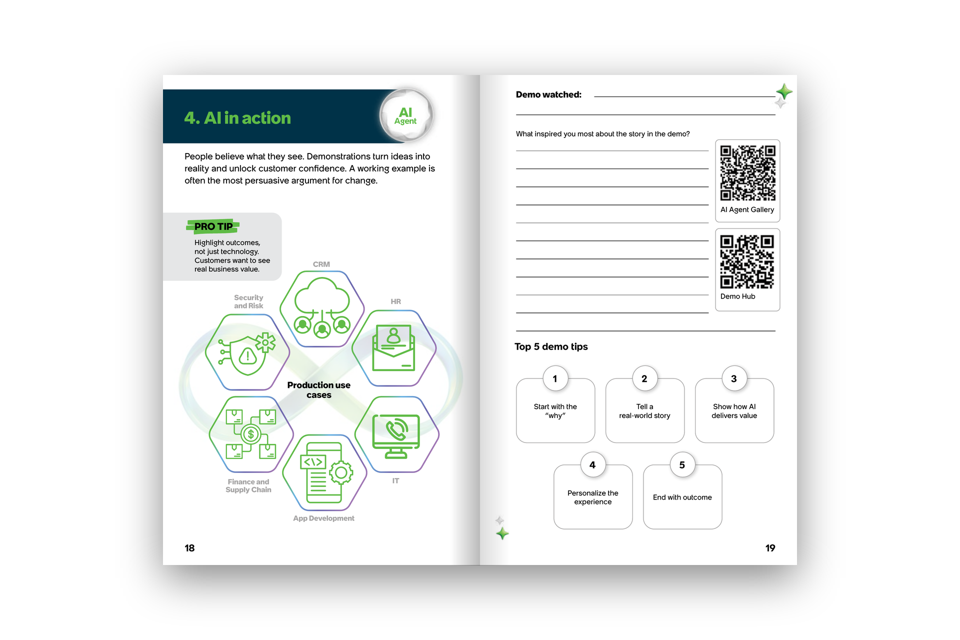
A book people carry gets judged with their hands. It has to work before anyone reads a word.
What made it hard
None of this was hard the way a pitch is hard. Nobody had to be persuaded. The difficulty was the opposite: keeping two years of work, for a team that never slowed down, looking like it came from one hand, inside a brand that was not mine.
constraints
The brand was fixed and I was not the one who fixed it. Every decision had to land inside guidelines written by someone I never met, with a typeface I did not choose, and still look like a decision rather than a default.
The calendar never stopped. A program guide refresh, a summit, a kickoff, a regional event and a conference book do not queue politely. Most of this work overlapped, and the people approving it were in California, Mumbai and Amsterdam, so a round of edits arrived at every hour of the day.
The book was built for a floor, not a desk. A conference guidebook is read standing up, in a crowd, in bad light, by someone looking for one room number. Type sizes, the map, the QR codes and the notes pages all had to be tested against that, not against a screen.
What lasted
The templates outlived the engagement. The guide family was built so the partner team could keep publishing on it, and they did. And the guidebook did what a printed thing is supposed to do at a conference: it was in people’s hands, then in their bags, then on their desks when they got home.
The lesson is the one I keep relearning. The work that lasts is the work that was built to be handed over. And the setup that works is the one we had: someone inside who understands the room, someone outside who makes the thing. That is still how I work.
Built inside their brand. Built to keep going without me.