
OKLAHOMA PROTEIN SNACKS
Red Dirt Ranch
A premium protein snack brand built from a cattle brand: one mark, five products, and a website that sells the private label side as hard as the snacks.
ROLE
Brand identity, packaging, and website design and build
DELIVERED
Primary badge mark and wordmark, a two-lockup system for web and retail, color and type system, a four-page brand guide, print-ready labels across five products with co-packer handoff, and a multi-page Shopify website
Client, Red Dirt Ranch. Delivered through Player Performance Group.
The Work
Red Dirt Ranch came to me as a name and a product: Oklahoma protein snacks to start, with more products planned down the road, headed for retail shelves and fundraising tables at the same time. It needed to look like it had been around for decades on day one, and to stretch past snacks when the line grows.
I presented two creative directions, Heritage Iron and Modern Ranch. Heritage Iron won, built on the idea that the brand already existed as a cattle brand burned into leather. Everything else followed from that mark.
The brief kept growing in the right direction. Identity led to packaging, packaging led to a website, and each step reused the system instead of reinventing it.
THE CENTERPIECE
Built for ventures that did not exist yet.
The mark
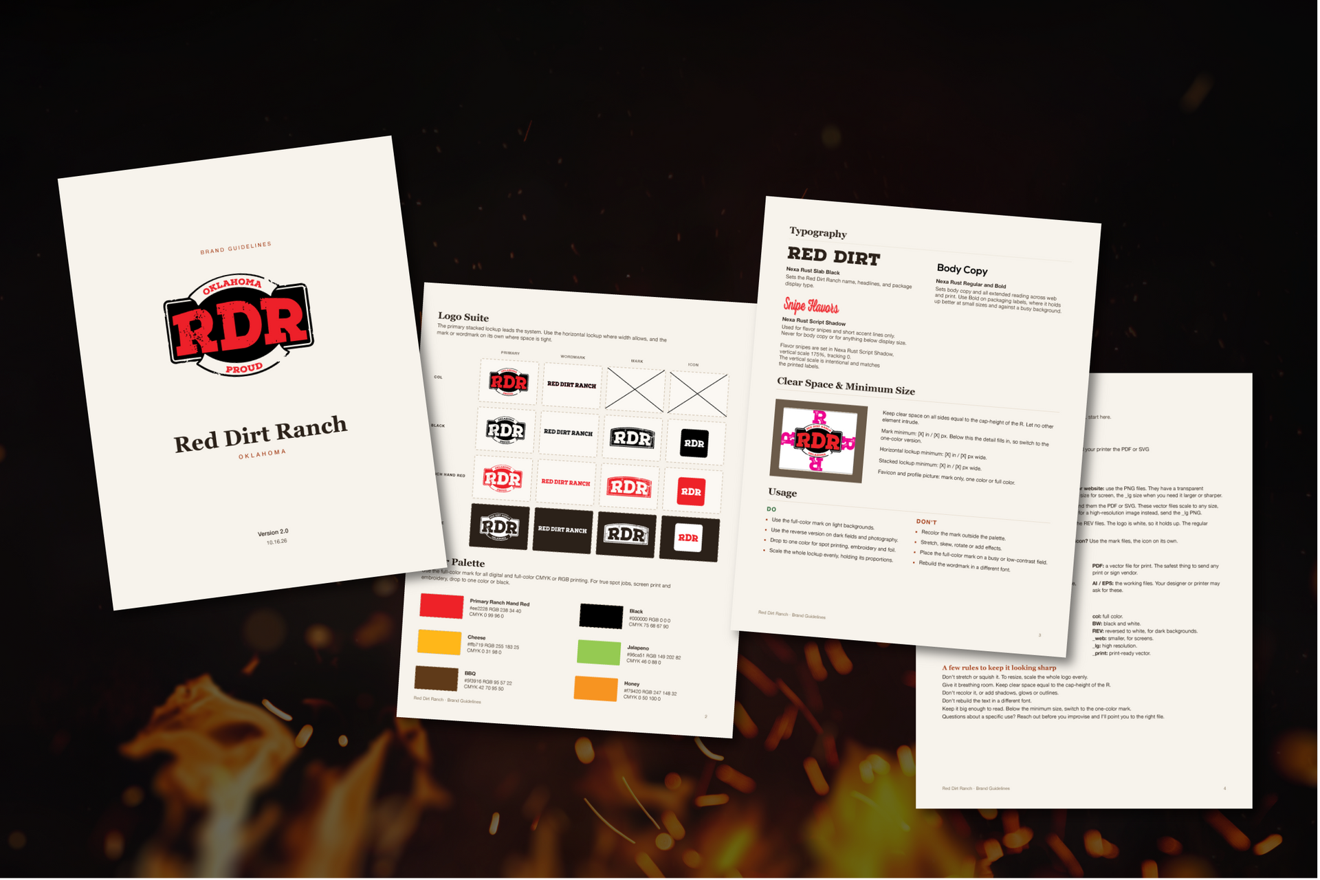
The badge is RDR set large in red on a black ground with weathered edges, framed by two ribbon arcs. The wear is real texture, not a filter: the grit lets the background show through, so there is never a white plate behind it.
The wordmark is built as two plates slightly off register, black over red, like a print that came off the press a little loose. It stays fully vector, so a one-color press can still run it.
The palette is Ranch Hand red and black, with four flavor colors held back for the packaging. Type is Nexa Rust Slab for display, Nexa Rust Script for the flavor snipes, and Nexa for everything that has to stay readable at small sizes.
One rule holds the family together
Every package carries the same badge, the same wordmark and the same black field. Only the script snipe changes color, so the shelf reads as one family from across the aisle and as five flavors up close.
The brand stays red and black. The flavor lives in the snipe.
The line
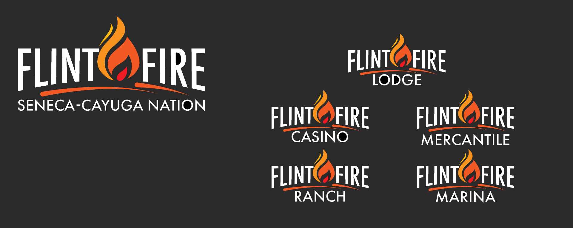
One parent. Many ventures. A single architectural rule keeps the family coherent:
- Sub-brand names sit at half the height of Flint Fire.
- Seneca-Cayuga Nation sits at quarter height, anchoring every application.
- Color discipline holds across the system. Sub-brands borrow the palette without replicating the mark.
The result is a family of brands where the parent is always present, never repeated.
Built to scale with the Nation, not against it.
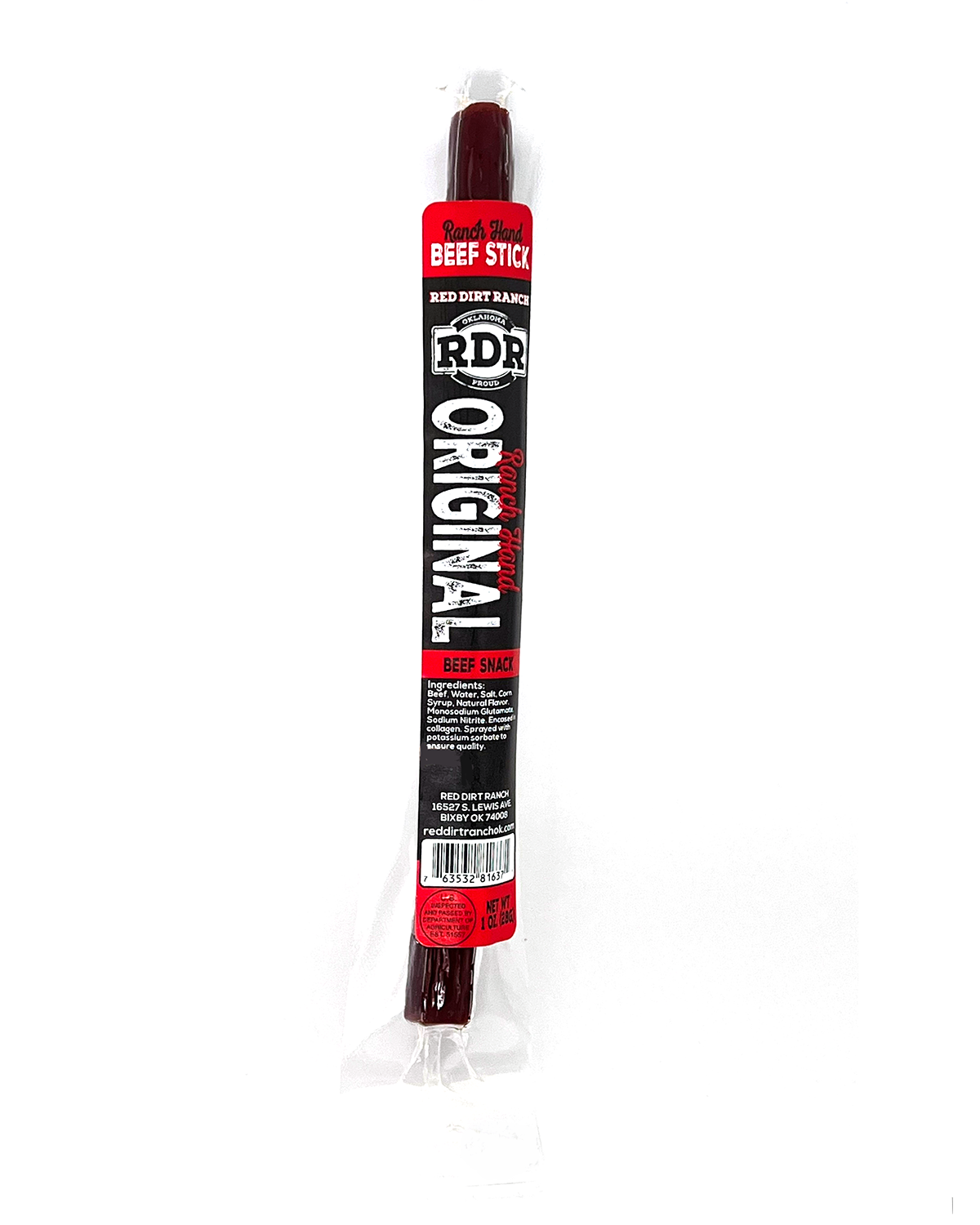
Ranch Hand Original (meat stick)
The original. Seasoned the way a ranch hand would want it after a long day.
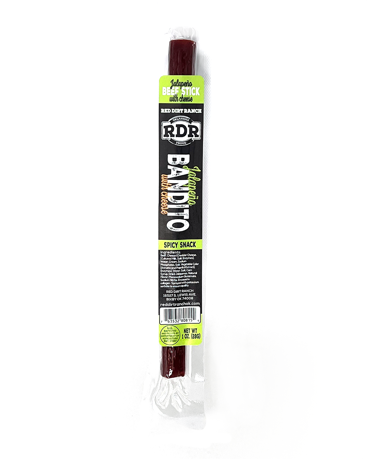
Jalapeño Bandito (meat stick)
Real jalapeño heat, signaled by a green snipe you can spot from the aisle.
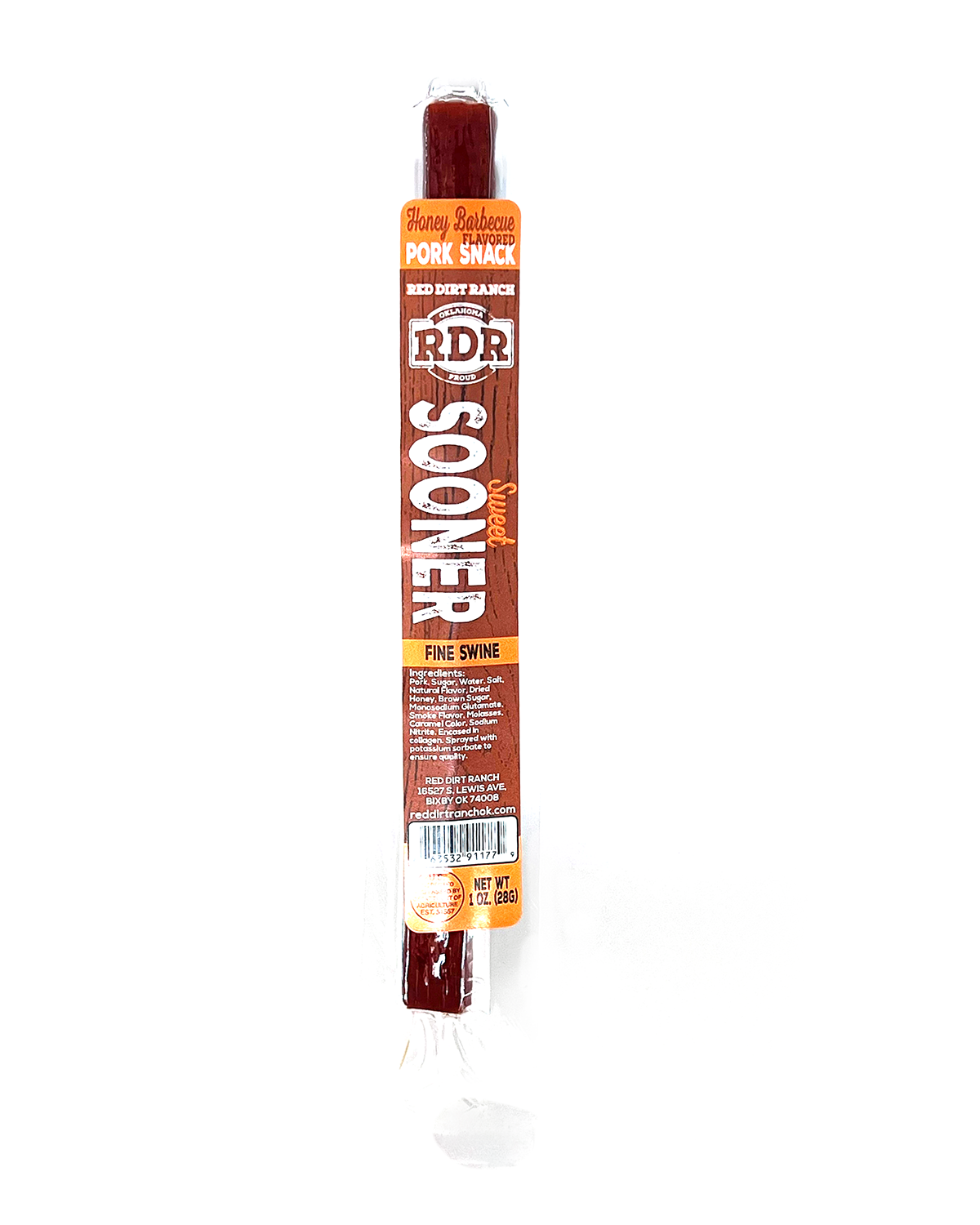
Sweet Sooner (meat stick)
A sweet, smoky stick with a name only Oklahoma could claim.
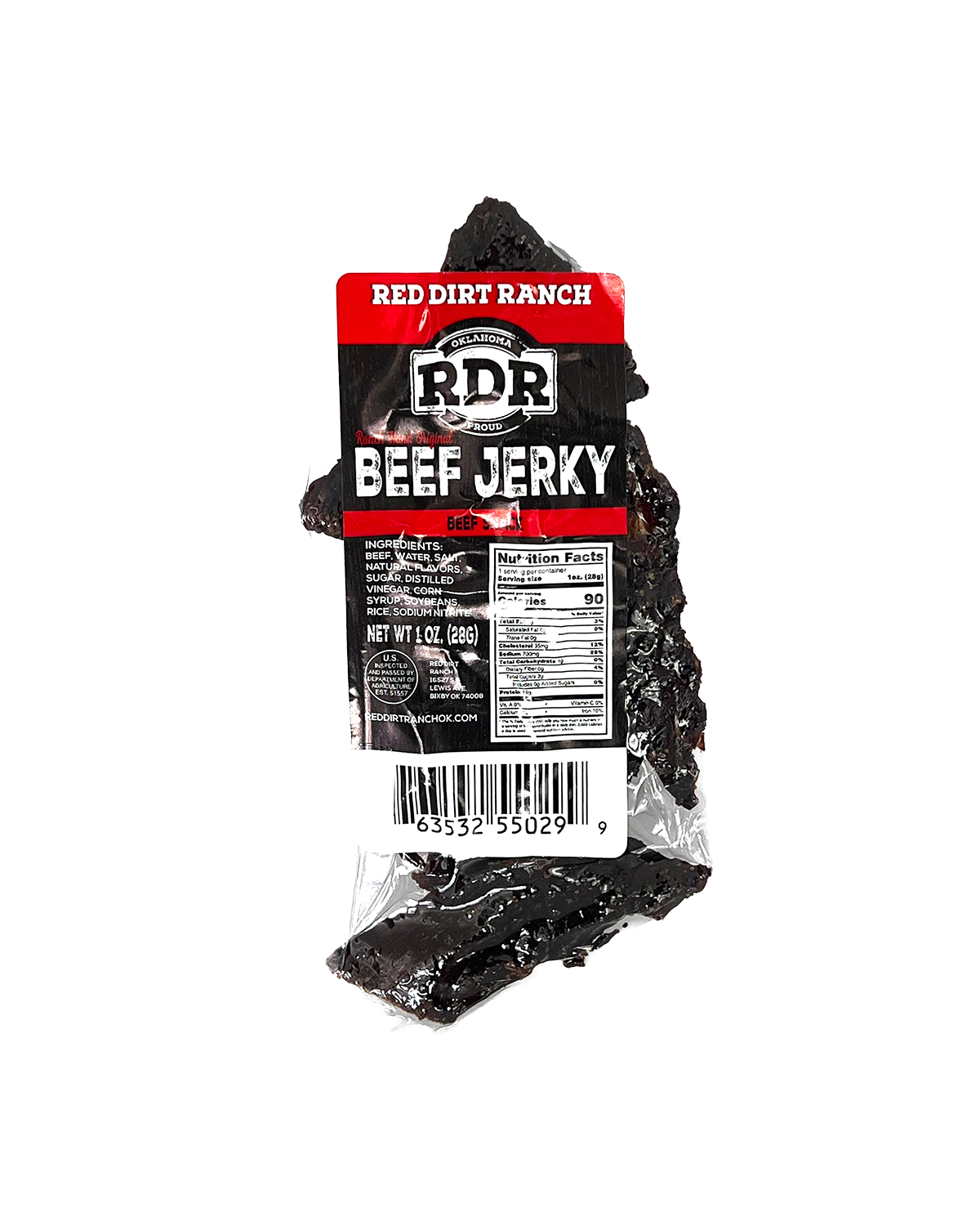
Original Beef Jerky
The flagship jerky on a 3 x 6 flat label, the first pack the system was built on.
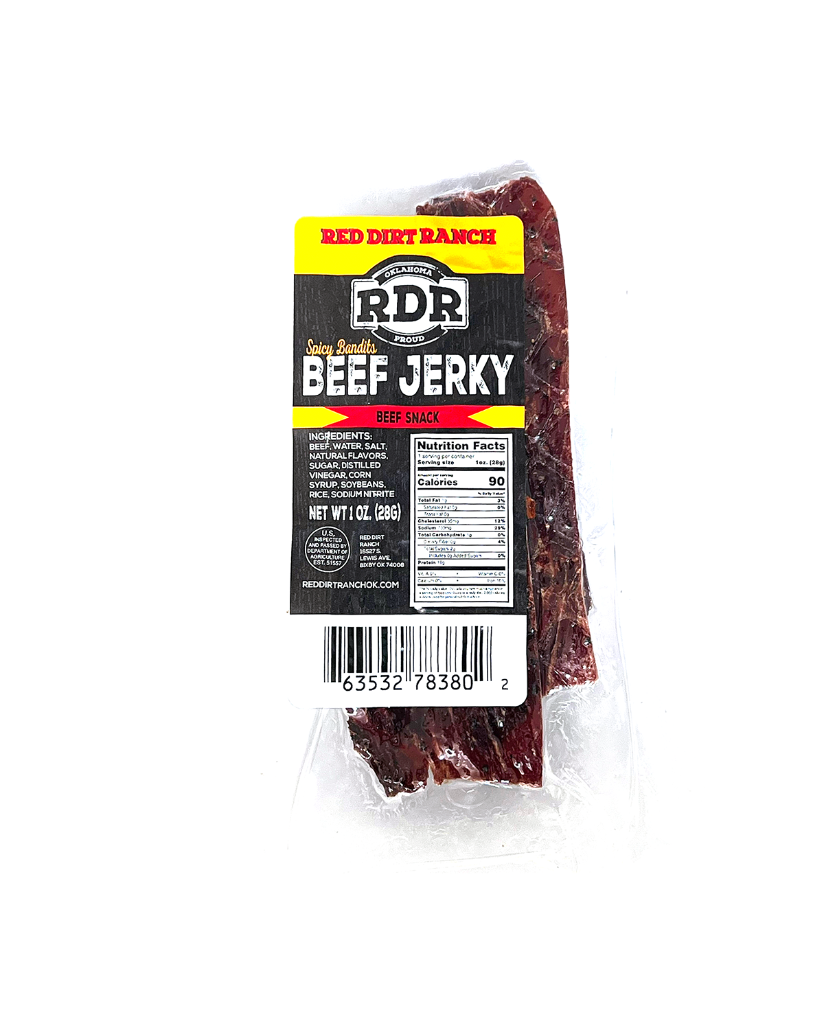
Spicy Bandits Beef Jerky
The jerky with a kick, carrying the Bandito heat into the jerky line.
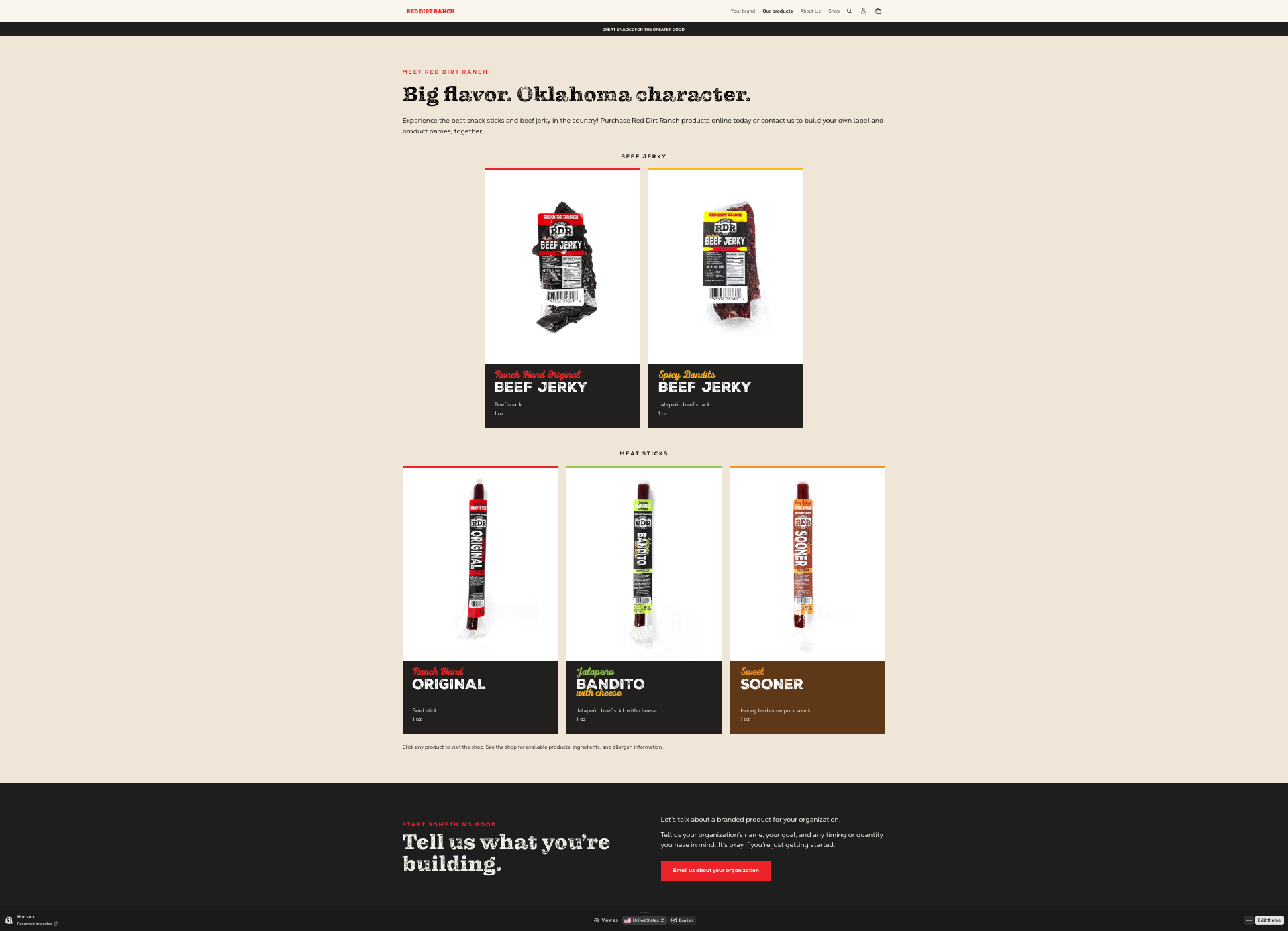
The website
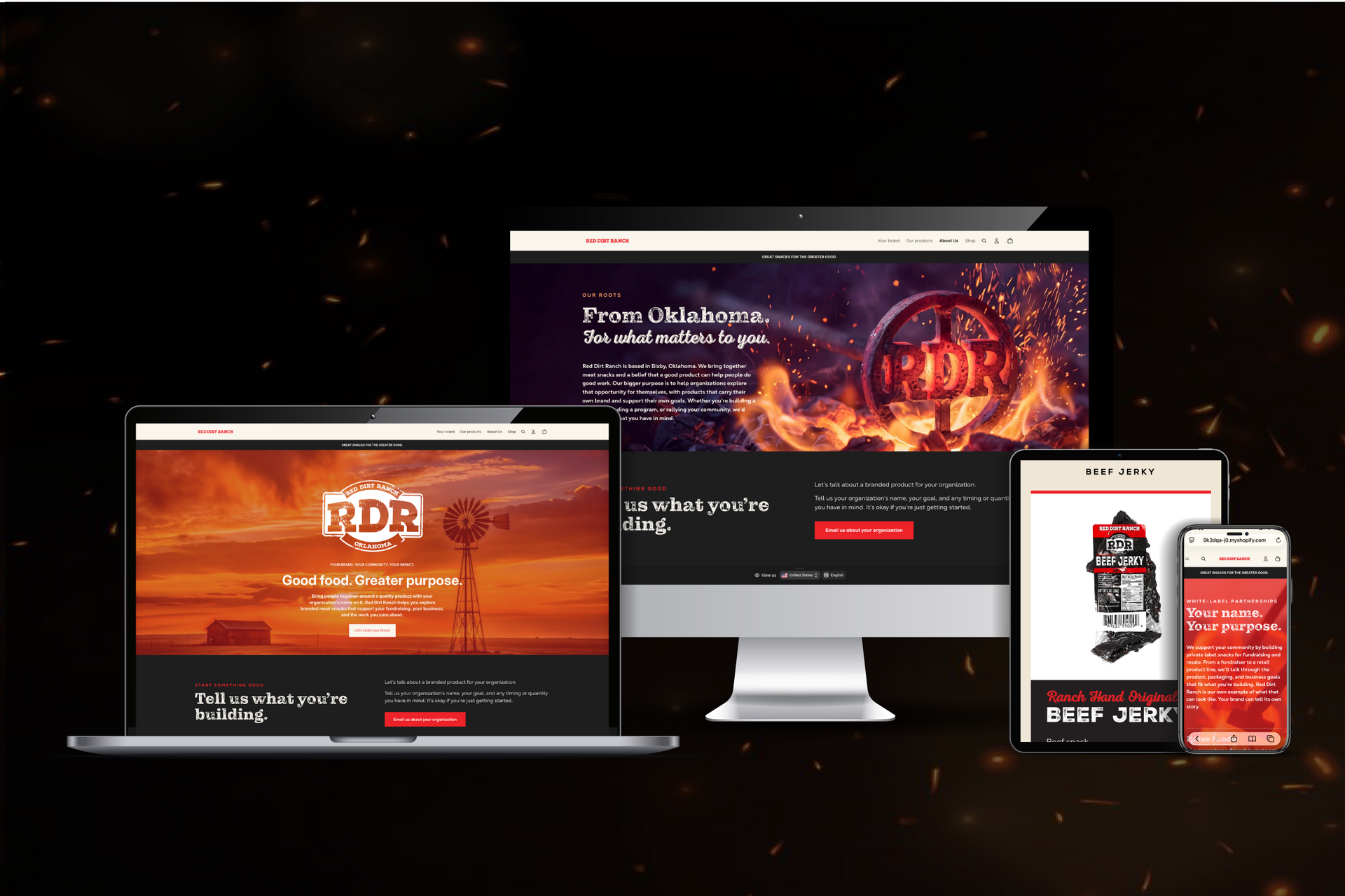
The site had one job beyond selling snacks: win private label work, so schools, teams and tribes can put their own name on Red Dirt Ranch products to raise money. That page needed its own link a coach could forward, so the site became multi-page instead of one long scroll.
I designed and built it in Shopify, with the store and the brand on one domain instead of two sites stitched together. The brand fonts run on the web, the product shots were cleaned to true scale, and every page ends with the same invitation to start a private label order.
Where it stands
The identity and packaging are on shelves, and the website is built and ready to launch on the client's schedule. Next up is retail display and the next round of products.
A new brand rarely gets to build its identity, packaging and website with one designer holding the whole system. Red Dirt Ranch did, so the badge on the label, the snipe on the shelf and the button on the site all come from the same set of decisions. When the next product arrives, the system is already waiting for it.
One designer from the first sketch to the checkout button. Nothing gets lost in a handoff, because there isn’t one.