A partially eaten slice of pizza with melted cheese, tomato sauce, and pepperoni sits on a plain white plate.

Nisqually Grounds
Brand Identity · Hospitality · Café

A partially eaten slice of pizza with melted cheese, tomato sauce, and pepperoni sits on a plain white plate.

Balance Yoga Barre:
A multi-year strategic relationship

From beloved local studio to scalable wellness brand

My work with Balance Yoga Barre ("BYB"), wasn't a single project, it was an evolving partnership that spanned nearly three years and touched every aspect of their brand, digital presence, and market positioning.

The outcome

In February 2026, a national fitness franchise, whose market entry threatened BYB's existence. They acquired Balance Yoga Barre instead of competing with them.


75%+ growth

More than 75% membership growth during the transformation period.

Acquired by a national fitness franchise

In just 9 months after their Tulsa market entry announcement.

The Brief

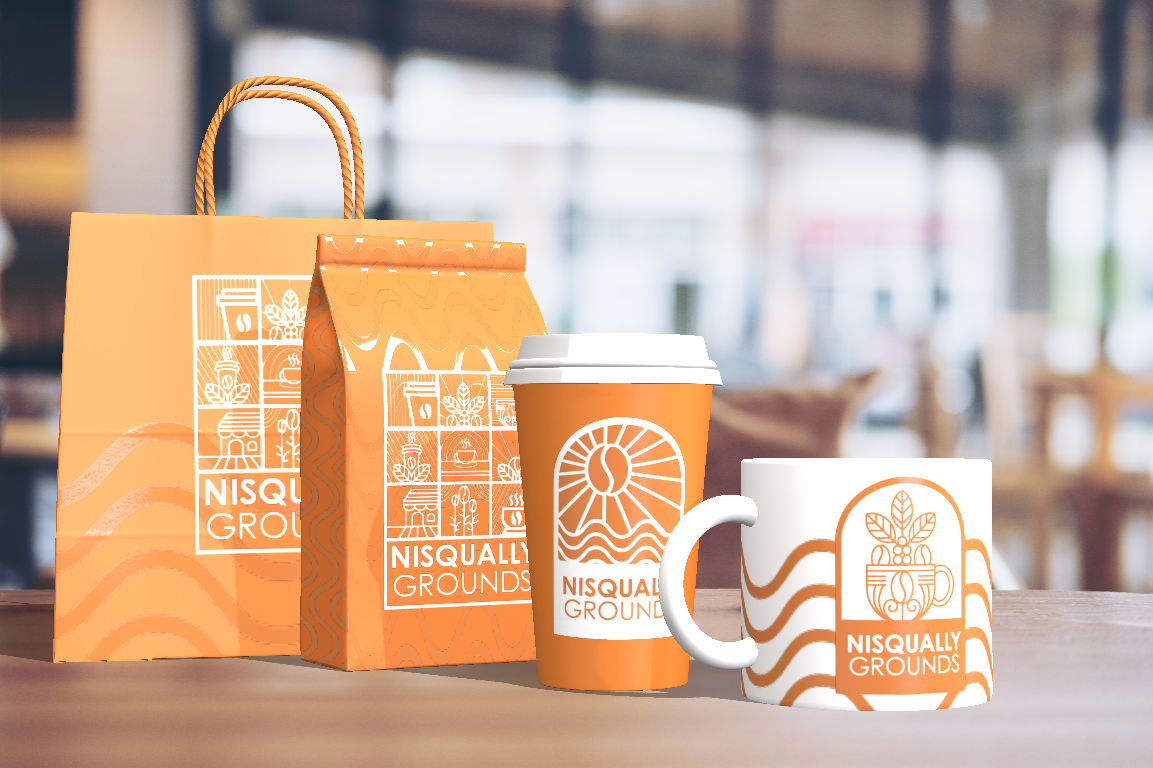
Nisqually Grounds is a coffee and ice cream shop inside The Delta Food Hall at Red Wind Casino, owned and operated by the Nisqually Indian Tribe in Olympia, Washington. The brand needed to hold its own next to a larger food hall identity while carrying a clear sense of place: the river, the tribe, the language.

A cathedral window border holds three carried meanings:

  • The coffee bean and sun rays at the center: the product, lit.
  • The waves below: the Nisqually River, which the tribe is named for.
  • The arched frame: stillness, ritual, the shape of a morning pause.

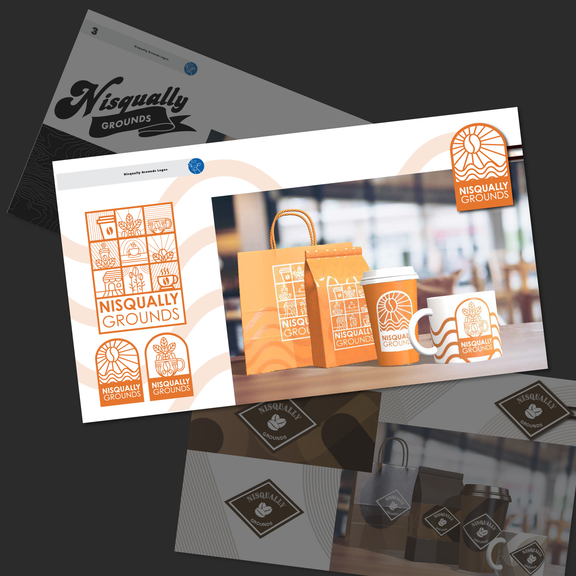
The mark is built to read at a single glance on signage, on a paper cup, on a cold cup, on a chalkboard menu.


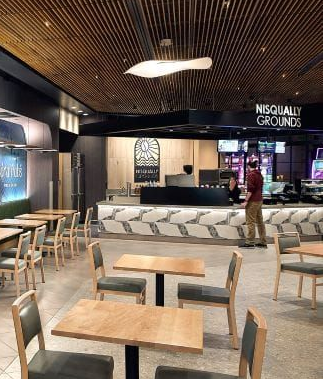
In the wild at Red Wind Casino

Nisqually Red Wind Casino Has New Dining Options
FROM SHOWCASE MAGAZINE

Nisqually Red Wind Casino Has New Dining Options

Time for Coffee or Ice Cream
RED WIND CASINO WEBSITE

Time for Coffee or Ice Cream

ANOTHER VIEW
FROM RED WIND CASINO'S FACEBOOK

ANOTHER VIEW

Brand & visual identity

Digital ecosystems

Competitive transformation

Brand & visual identity

Digital
ecosystems

Competitive transformation

Brand & visual identity

Building a visual system that could scale with ambition

When I began working with Balance Yoga Barre in late summer 2023, they had something precious: a deeply loyal community who loved their classes and instructors. But the visual identity couldn't carry that energy beyond the studio walls. The logo felt homegrown, the brand materials were inconsistent, and there was no cohesive visual language that could work across the growing number of touchpoints a modern wellness brand requires.

The owner had expansion plans. BYB had already begun exploring multi-location growth, and the brand needed to evolve from “beloved neighborhood studio” to “scalable wellness company” without losing the warmth and approachability that made people fall in love with it in the first place.

Creating the anchor

We started with the logo itself. The goal was something that felt both established and energetic, welcoming but not exclusionary, premium but not pretentious. The solution: a circular mark in deep emerald and gold that borrowed visual authority from heritage fitness brands while the hand-drawn quality of the letterforms kept it approachable.

Building the visual language

A logo is just a mark until it becomes a system. We built comprehensive brand guidelines covering every touchpoint: typography that felt confident but not cold, photography direction that captured real bodies doing real work, and graphic elements that could flex from digital to print without losing their impact.

Creating the anchor

We started with the logo itself. The goal was something that felt both established and energetic, welcoming but not exclusionary, premium but not pretentious. The solution: a circular mark in deep emerald and gold that borrowed visual authority from heritage fitness brands while the hand-drawn quality of the letterforms kept it approachable.

The color palette told its own story. That deep green signaled premium wellness, growth, natural energy. The gold added warmth and aspiration without feeling out of reach. Together, they created a foundation that could work across everything from Instagram posts to physical studio signage to retail merchandise across multiple locations.

Building the visual language

A logo is just a mark until it becomes a system. We built comprehensive brand guidelines covering every touchpoint: typography that felt confident but not cold, photography direction that captured real bodies doing real work, and graphic elements that could flex from digital to print without losing their impact.

The most valuable piece was the custom illustration library I created specifically for BYB. The figures built to capture the actual movements and energy of barre, yoga, and strength training. Warm, accessible, and unmistakably theirs. Assets no national chain could replicate.

The positioning strategy was just as critical. BYB needed to own a specific space: community-driven premium wellness. Not the cheapest option, not the fanciest gym. It was the place where the people mattered as much as the workout.

Creating the anchor

We started with the logo itself. The goal was something that felt both established and energetic, welcoming but not exclusionary, premium but not pretentious. The solution: a circular mark in deep emerald and gold that borrowed visual authority from heritage fitness brands while the hand-drawn quality of the letterforms kept it approachable.

Building the visual language

A logo is just a mark until it becomes a system. We built comprehensive brand guidelines covering every touchpoint: typography that felt confident but not cold, photography direction that captured real bodies doing real work, and graphic elements that could flex from digital to print without losing their impact.

The most valuable piece was the custom illustration library I created specifically for BYB. The figures built to capture the actual movements and energy of barre, yoga, and strength training. Warm, accessible, and unmistakably theirs. Assets no national chain could replicate.

The positioning strategy was just as critical. BYB needed to own a specific space: community-driven premium wellness. Not the cheapest option, not the fanciest gym. It was the place where the people mattered as much as the workout.

A Diet Coke can sits on a surface in front of a person working on a laptop while wearing a smartwatch.

Building the website

The website design and build became the foundation for everything else. We designed it around the actual customer journey: discovery, trial offer, membership conversion. Every page had a clear job. The homepage established credibility and energy. Class descriptions were informative without being overwhelming. Instructor bios made you feel like you already knew them before walking in.

Integration with MindBody meant people could browse the schedule, book a trial class, and create an account without leaving the site. Mobile optimization wasn't an afterthought. Most people were discovering BYB on their phones during lunch breaks or late at night when they were finally thinking about self-care.

Building the website


The website design and build became the foundation for everything else. We designed it around the actual customer journey: discovery, trial offer, membership conversion. Every page had a clear job. The homepage established credibility and energy. Class descriptions were informative without being overwhelming. Instructor bios made you feel like you already knew them before walking in.

A Diet Coke can sits on a surface in front of a person working on a laptop while wearing a smartwatch.
A person sits on a rustic, wood-block counter in front of a dark wall featuring a glowing

Building the website

The website design and build became the foundation for everything else. We designed it around the actual customer journey: discovery, trial offer, membership conversion. Every page had a clear job. The homepage established credibility and energy. Class descriptions were informative without being overwhelming. Instructor bios made you feel like you already knew them before walking in.

Integration with MindBody meant people could browse the schedule, book a trial class, and create an account without leaving the site. Mobile optimization wasn't an afterthought. Most people were discovering BYB on their phones during lunch breaks or late at night when they were finally thinking about self-care.

Managing the technical infrastructure

Beyond designing the website, I took over MindBody system management and became the go-to person when anything went wrong with the platform. This wasn't just about making things look good. It was about making sure the technical infrastructure actually worked.


The technical work matters because it's invisible when it works and catastrophic when it doesn't. Keeping the digital infrastructure running smoothly meant members had a friction-free experience from first click to hundredth class.

Three dark green smartphones featuring a gold circular
A group of nine women in black workout attire hold exercise balls in a studio with the
Two individuals in black athletic wear smile while exercising at a wooden ballet barre against a black background.
Two people in a dimly lit studio perform a forearm plank on yoga mats with the text

Building ongoing engagement

While the studio managers handled day-to-day social media posting, I created the branded content assets they needed. Event graphics, challenge announcements, promotional campaigns, seasonal content. Everything was designed to maintain brand consistency across channels while giving each manager the flexibility to post in their own voice.


Email marketing became more than announcements. We built campaigns that created accountability, celebrated milestones, introduced challenges, and reminded people why they joined in the first place. The goal wasn't just to fill classes, it was to keep members engaged and coming back.

The transformation

Click on an icon below to jump to the type of transformation: physical, video/photography, website, data strategy.

THE RESULTS:

More than 75%

membership growth during the transformation period.

A black outline icon of a hammer crossed with a hand saw.

The physical transformation

Beyond digital and brand work, I led the complete physical studio transformation. I designed the refreshed interiors, coordinated contractors and paint crews, and sourced new equipment, all while ensuring nothing interrupted the class schedule. This included me designing bespoke storage for all equipment to bring our brand style to the interior, as well as new artwork for the walls (extremely large canvas prints in black & white photos from the photo shoot, with Michelle Bennett, mentioned below).

A retail display wall with wooden shelves featuring white rectangular signage, rows of black bottles, and round products.
An interior room with dark flooring, wooden shelving units, and people preparing for a class.

The studio needed to match the professionalism of the website, the sophistication of the digital systems, and the credibility of the marketing materials. When the new competitor opened their Tulsa location in fall 2025, BYB didn't look like a scrappy local competitor. We looked like the established, premium choice.

More Work

Continue Exploring