APACHE CASINO HOTEL
Systems Work
Twenty months of marketing for a casino hotel in Lawton, Oklahoma, up to forty pieces a month. Posters, mailers, kiosk screens, newsletters, billboards and two commercials, and not one of them started from a blank page, because the system had already made the decisions.
ROLE
Marketing design lead for the property, through Player Performance Group.
Built the advertising system, then ran everything on it.
Monthly production, print, digital and broadcast, from concept to the printer’s inbox.
DELIVERED
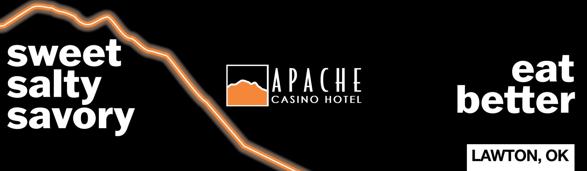
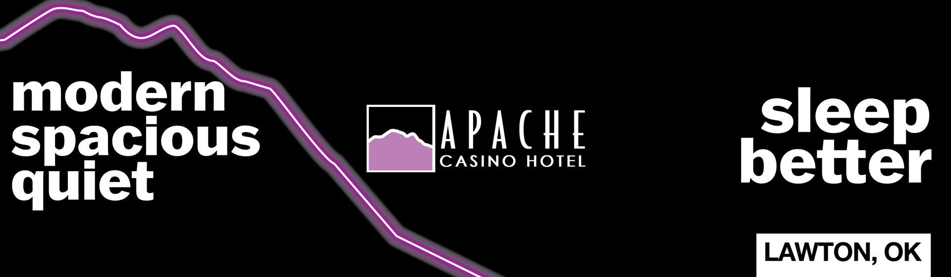
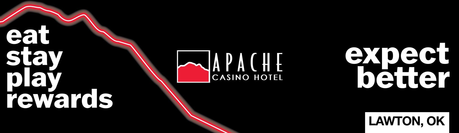
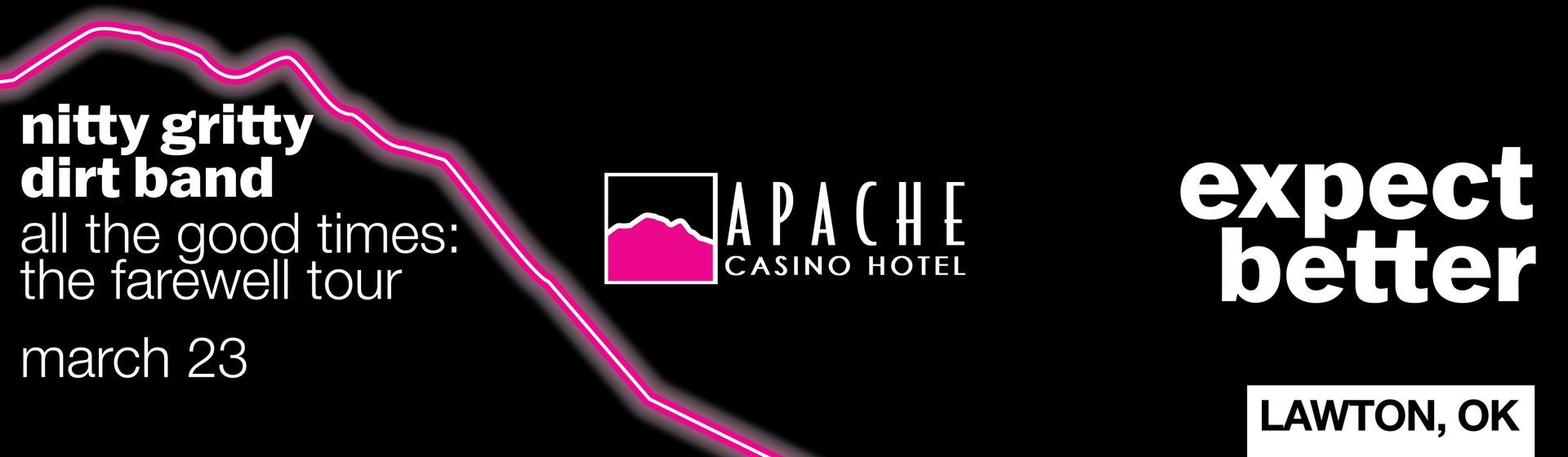
One system: three words, lowercase, one bold; a neon peak from their mountain; a fixed color for each side of the business and two or three chosen for each month.
Twenty months, up to forty pieces a month. Posters, kiosk screens, postcards, mailers, newsletters, invitations, billboards, menus, two commercials.
Brand work with Player Performance Group. Advertising concept developed with Michael Grim.
I’ve worked with countless graphic designers over the past 25 years and Brooke is my absolute favorite.
My favorite parts of working with Brooke is how intuitive she is on every job, always having great ideas that make each project pop. She quickly got to know my preferences and was able to design with minimal input from me which freed up a ton of my time.

Michael Grim
Player Performance Group
The Work
It came through Player Performance Group, as all of my casino work has, and it ran month in and month out from the summer of 2024 into 2026, with PPG's account lead between me and the property for most of it. A casino hotel markets like a small city. There is something new every week, in every channel, for people who already know your name, and there is no month off. Left alone, that volume turns into chaos: forty pieces, forty sets of choices, forty chances to drift.
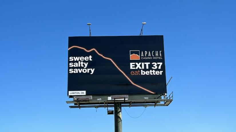
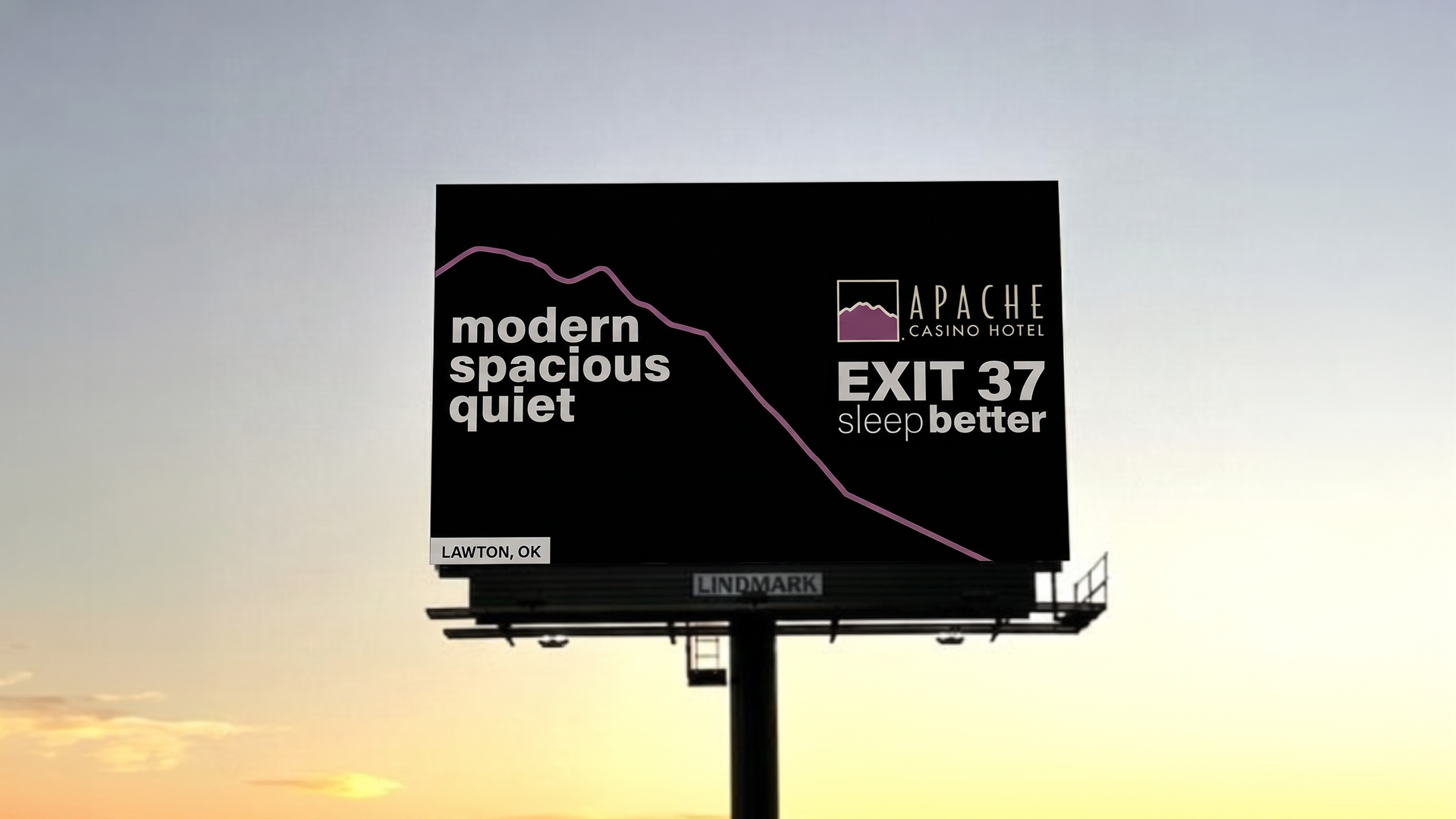
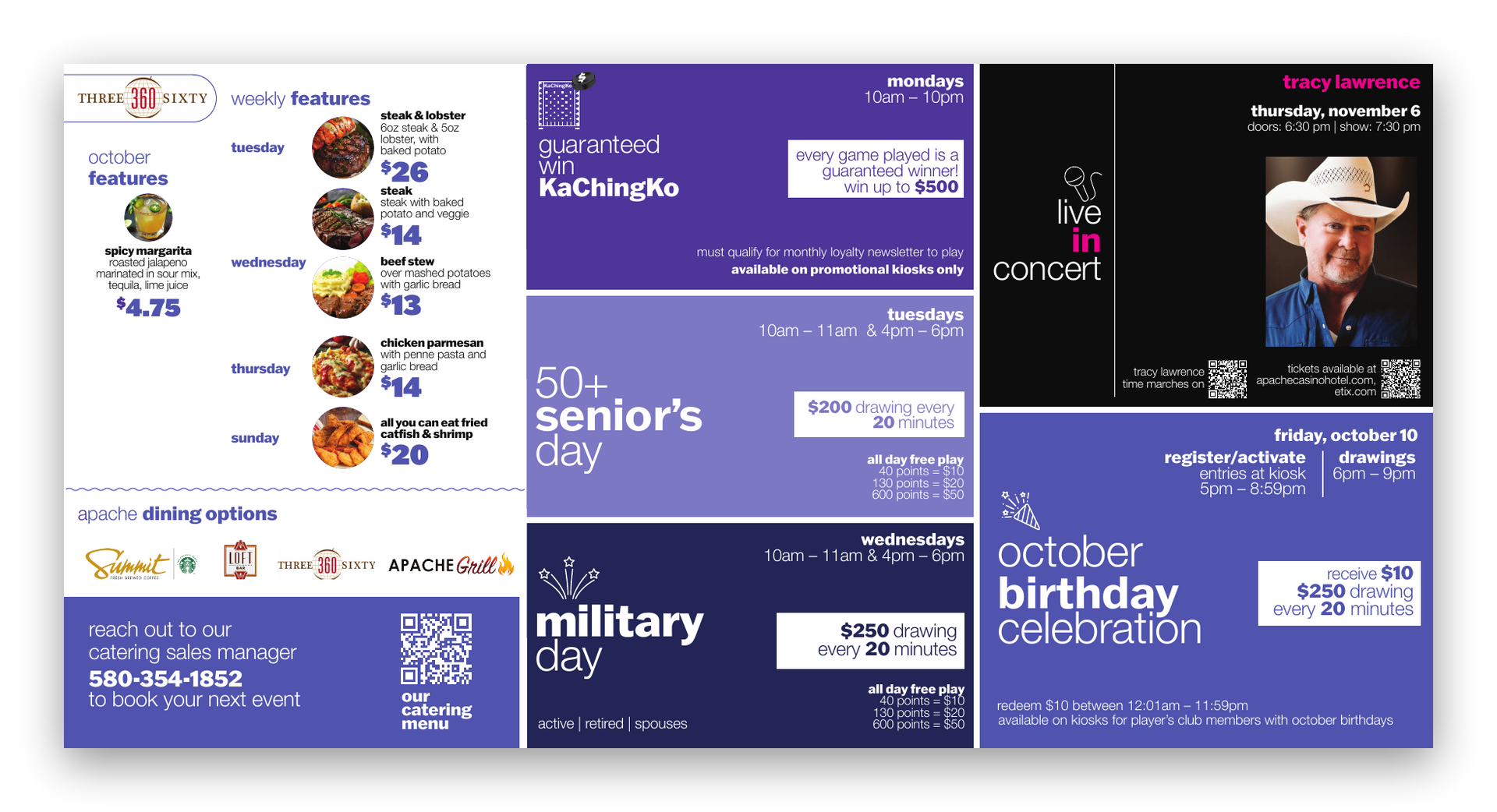
The logo was theirs and it stayed theirs. What we built, as a team, was the system around it, and the point of the system was to make the decisions once. The words came first: a headline is three of them, lowercase, always, one of them bold. Then the colors. Each side of the business got a fixed color that never moved: purple for the hotel, orange for food, bright pink for entertainment, red for the property itself. And each month got two or three colors of its own, chosen once at the top of the month, so that everything the property put out in October looked like October and everything in December looked like December. A neon line traced the mountain in their mark and crossed every billboard. After that, nobody had to ask what a poster looked like. They asked what it said.
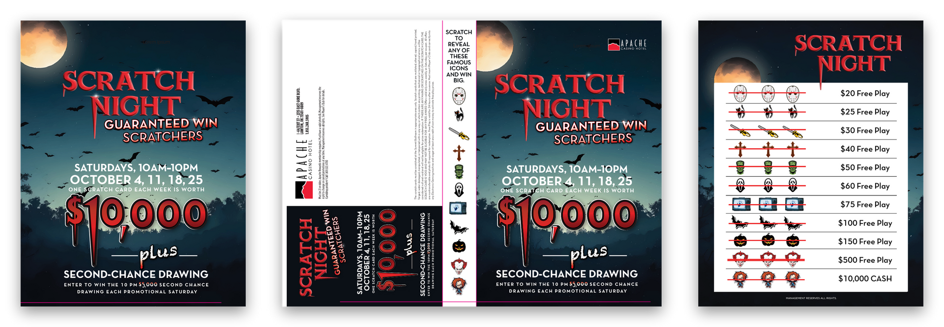
Then it ran. Twenty months of posters, kiosk screens, postcards, mailers, newsletters, invitations, prize keys, billboards, menus, and two television commercials where I built the layered art and worked alongside the editor. The slowest month was seven pieces. The busiest was forty, and every one of those went out in several sizes and formats besides. Each one was tracked by draft number until it landed with the printer or on the property’s screens, and each one looked like it came from the same hand, because in the way that matters, it had.
Once the system was settled, I wrote it down so there was something to follow: the type, the colors, the three-line headline, the highlight box, the icons, how the peaks are drawn, how a month's palette gets chosen. Five pages. Casinos turn over people fast, on the property side and the agency side both, and a system that lives only in one designer's head leaves with her. This one did not have to. When I first stepped away from the account it went to the next designer with the files, and it worked in someone else's hands before it came back to mine.
THE CENTERPIECE
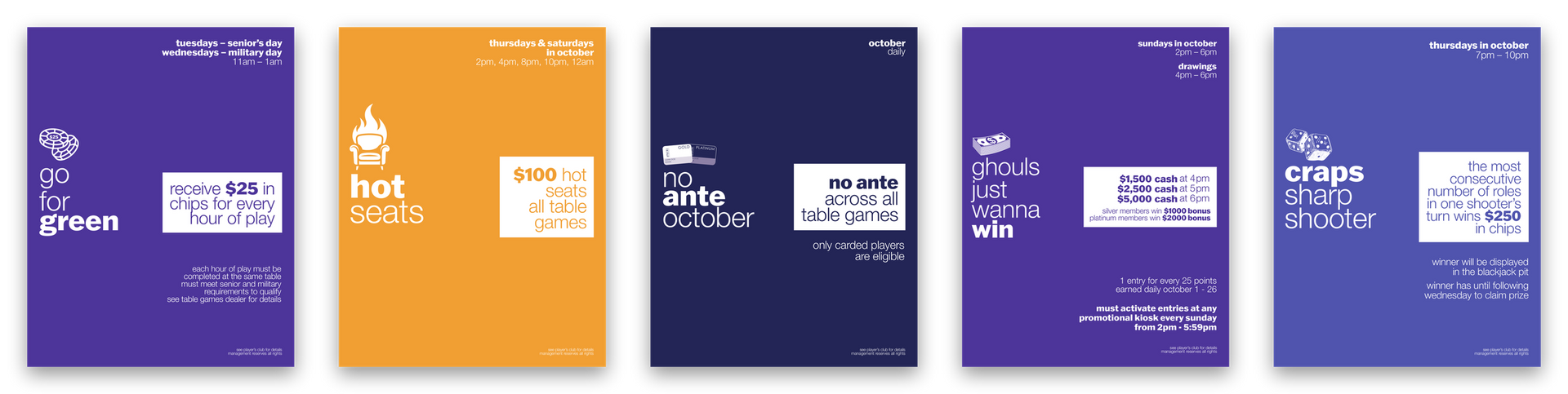
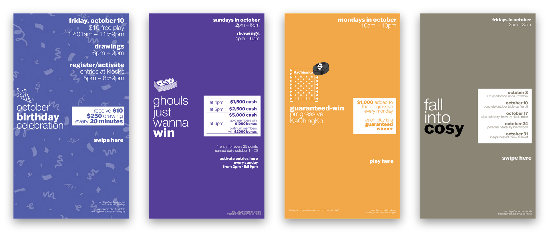
One month. Every piece the property put in front of a guest in October 2025, posters to postcards to kiosk screens, laid out together. Forty-four pieces, one set of decisions, and you can see October’s three colors holding across all of them.
Chaos is forty pieces in a month. Order is never having to decide how any of them look.
What made it hard
Nothing on this page was hard to design once. The difficulty was designing it so that the last piece in month twenty was as easy as the first, inside a mark I did not draw, for a property that never had a slow month.
constraints
The logo was fixed. Black on top, a colored mountain below, two typefaces I would not have chosen. The system had to make that mark look intentional everywhere it went, which meant building the language out of the mountain rather than around it.
The calendar was the client. A casino promotes every week of the year, and the pieces do not queue. A newsletter revision, a concert poster, a mailer for a car giveaway and a set of kiosk screens all landed in the same week, every week, each with its own printer, its own size and its own deadline. A system that needed a designer’s judgment on every piece would have collapsed by the second month.
Most of it is read in passing. A billboard at highway speed, a poster on the way to the floor, a postcard on the way to the trash. The rule of three words, one bold, came from that: there is no room for a second idea, so the design has to make the first one land, and it has to do it without anyone stopping to think.
What lasted
The guide outlived the engagement, which was the point of writing it. In a business where the marketing team you started with is rarely the one you finish with, the templates, the area colors, the monthly palette and the three-word rule were built so the property could keep publishing on them no matter who was in the chair.
The casino was the stress test. Forty pieces a month is more than any founder-led business will ever need, and that is exactly why it proved the point: a system is not a set of rules, it is the decisions you make once so that nobody has to make them again. Built well, it lets a small team look like a large one without anyone noticing the seams. That is what I build now, for businesses whose calendar is kinder than a casino’s, and it is still the job.
Twenty months. One set of decisions.